

How to Choose an AI Landing Page Generator and Launch Faster
Compare AI landing page generators by editing, lead capture, and launch limits. See an Enter Pro demo and learn how to build a page you can test and improve.
Figure 1. A landing-page workflow moves from a clear brief to an editable page and a verified next step. Concept illustration.
The most useful detail in my HandoffFlow walkthrough was a small error message: “Enter your company name.” The form identified the missing field while keeping the other visible answers. That told me more about the visitor’s next step than the hero design alone.
That is the question I would ask before choosing an AI landing page generator: what happens after someone decides to act? A draft can explain an offer clearly while submission handling, follow-up, and measurement still need work.
I rebuilt the demo around one campaign brief and followed it from planning through refinement to a published page. Here, I compare the requirements that matter, explain what the captures show, and identify the checks I would finish before sending campaign traffic.
What Does an AI Landing Page Generator Actually Produce?
An AI landing page generator turns a description into some combination of copy, layout, components, and code. The label alone tells you surprisingly little about the finished workflow. I separate the output into three levels because each one needs a different kind of review.
| Output | What you receive | What remains to check |
|---|---|---|
| Copy draft | Headlines, benefits, objections, and CTA wording | Accuracy, proof, tone, and placement |
| Page draft | A responsive layout with editable sections or code | Real content, interaction states, and publishing |
| Connected funnel | A page with submission handling and follow-up integrations | Record delivery, failure recovery, and event accuracy |
You may receive a page draft even when the interface shows a successful form animation. A confirmation panel can run entirely in the browser. It does not establish that a server accepted the request or that your sales team received it.
Check the Output You Can Actually Change
I look beyond the preview and ask where the editable source lives. Can you replace a section, update the CTA destination, and adjust a form without regenerating the entire page? If the campaign changes next week, those everyday edits matter more than the first generation speed.
Check the handoff, too. A hosted editor, downloadable code, and a connected repository offer different maintenance paths. Choose one your team can manage after the original builder leaves. An attractive page becomes expensive when a small copy change requires rebuilding unrelated sections.
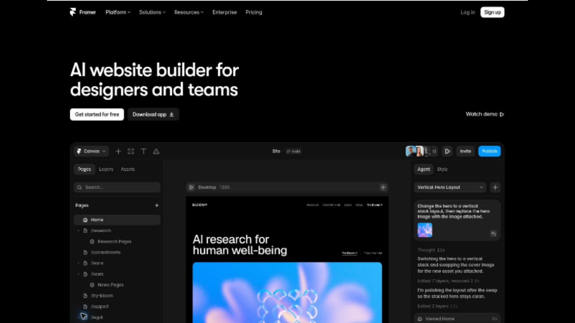
Figure 2. Framer places its canvas preview below the main promise and signup action. Original page screenshot; captured 8 October 2026.
Choose the Best AI Landing Page Builder for the Campaign Goal
The best AI landing page builder depends on the action you need. A newsletter signup, a sales demo, and a product purchase have different qualification requirements. I start with the offer and destination before comparing templates or AI models.
For HandoffFlow, the fictional product used in this walkthrough, the audience is operations leads at 50–200-person SaaS companies arriving from a LinkedIn ad about incident handoffs. The offer is to request a 30-minute demo. Those details give you a concrete test: does the page continue the ad’s promise and explain what happens after the request?
Use the Same Brief Across Your Shortlist
Give each candidate the same audience, offer, approved claims, and required sections. Then make one realistic revision: change the company-size field, move proof above the form, or remove a navigation link. You learn more from that second task than from another polished homepage preview.
My shortlist separates editing effort, mobile behavior, submission handling, and handoff quality. The best landing page builder for that brief should support both the first layout and the revisions needed afterwards. A familiar template editor may be sufficient for a simple offer with an established CRM.
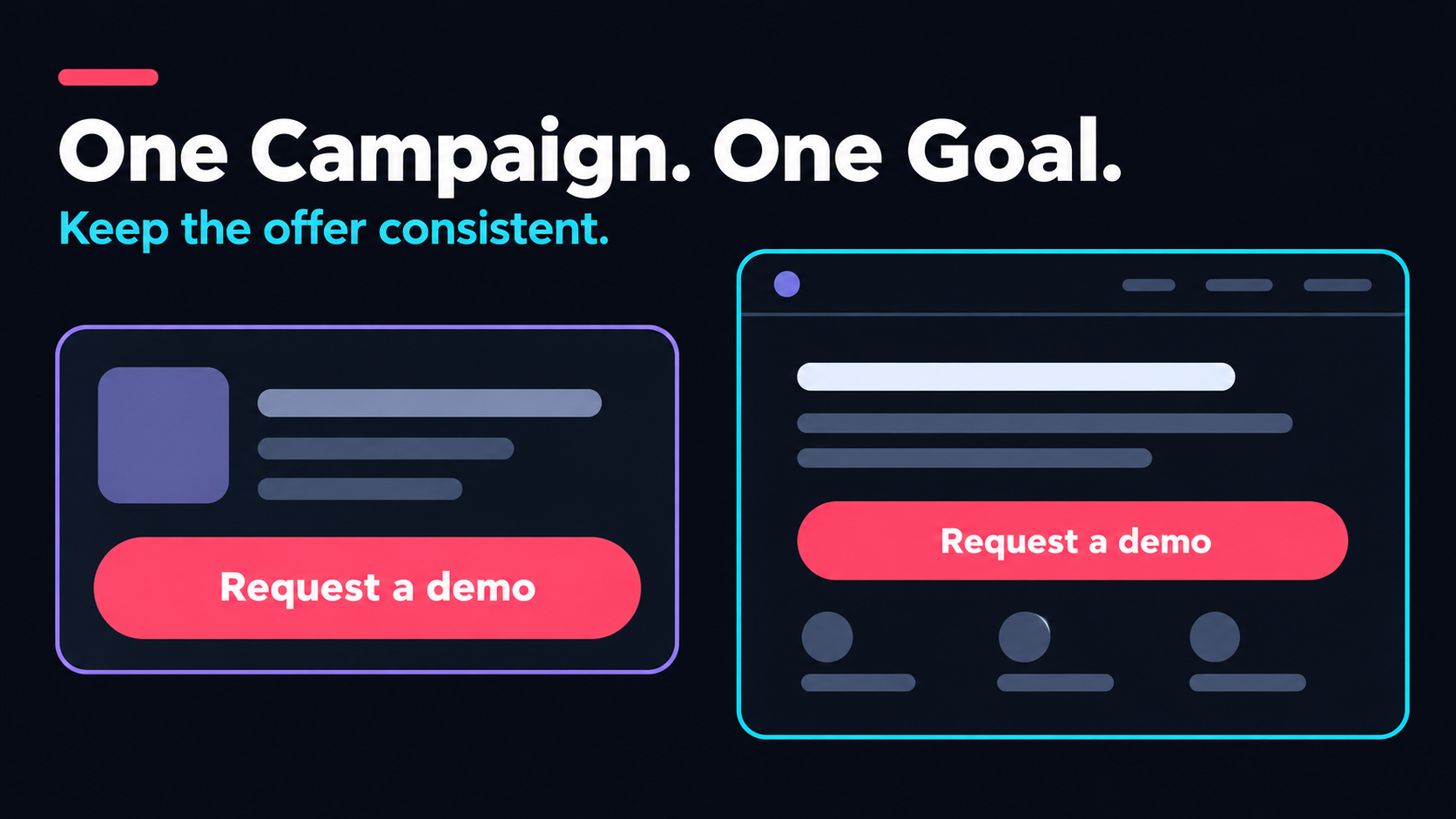
Figure 3. Carry the same offer from the campaign into the page and its main action. Concept illustration.
Notion's AI page makes two commitments visible: Try for free and Request a demo. I would choose the action that matches the incoming campaign rather than copy both into a focused paid-traffic page. You can borrow its clear action labels without borrowing its entire navigation.
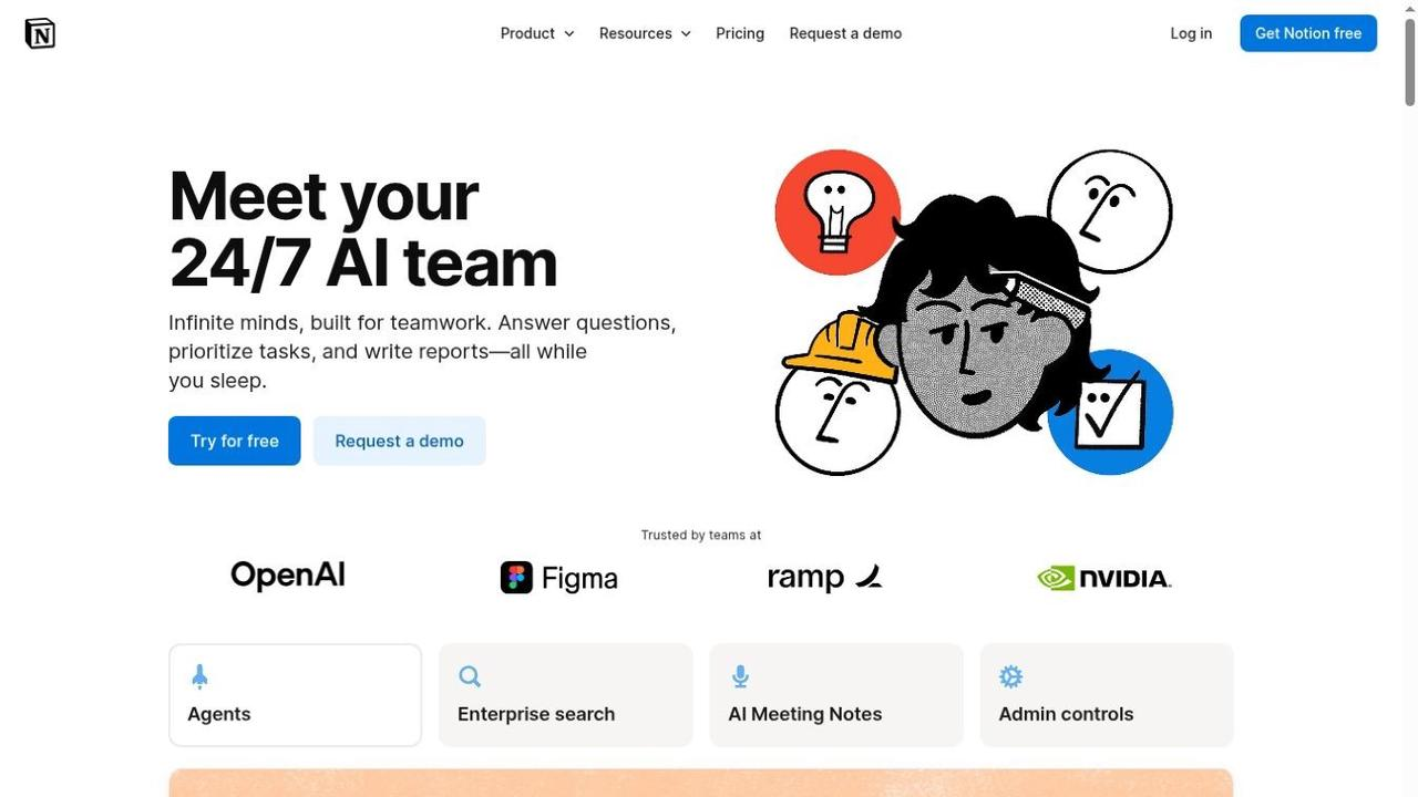
Figure 4. Notion separates self-service access from a sales conversation with two clearly labeled actions. Original page screenshot; captured 8 October 2026.
Check Experimentation Before You Need It
If you expect repeated paid campaigns, ask how you will compare variants. Unbounce's official A/B testing features include traffic allocation and experiment reporting. That is a different requirement from generating two layouts and deciding which one looks better.
You still need a defined conversion, a stable audience, and enough observations to interpret an experiment. A handful of submissions would not convince me to declare a winner, especially if the ad targeting changed midway through the test. The experiment should answer one question you can act on.
Which Type of Landing Page Tool Fits Which Need?
A landing page builder is a broad category. Some tools center on marketing operations; others generate application code or work inside a design system. The categories overlap, so I use them to identify the starting workflow rather than to impose rigid limits on a product.
| Starting workflow | Good fit | Question to resolve |
|---|---|---|
| Copy assistant | You already have a page and need stronger messaging | Who verifies every generated claim? |
| Design-to-code workspace | You need interactive output aligned with existing design assets | How will real data and publication work? |
| Campaign platform | You regularly launch paid traffic and compare variants | Are integrations and testing included in your plan? |
| App-building workspace | The page needs custom behavior or may grow into a product | Who reviews the generated implementation? |
| Email platform's page builder | Signup and newsletter delivery are the main goal | What happens when subscriber or page limits are reached? |
Figma's AI landing page generator is part of Figma Make. Its current documentation describes responsive, interactive pages, editable code, publishing, and Supabase connections. I treat it as an implementation option when evaluating the workflow.
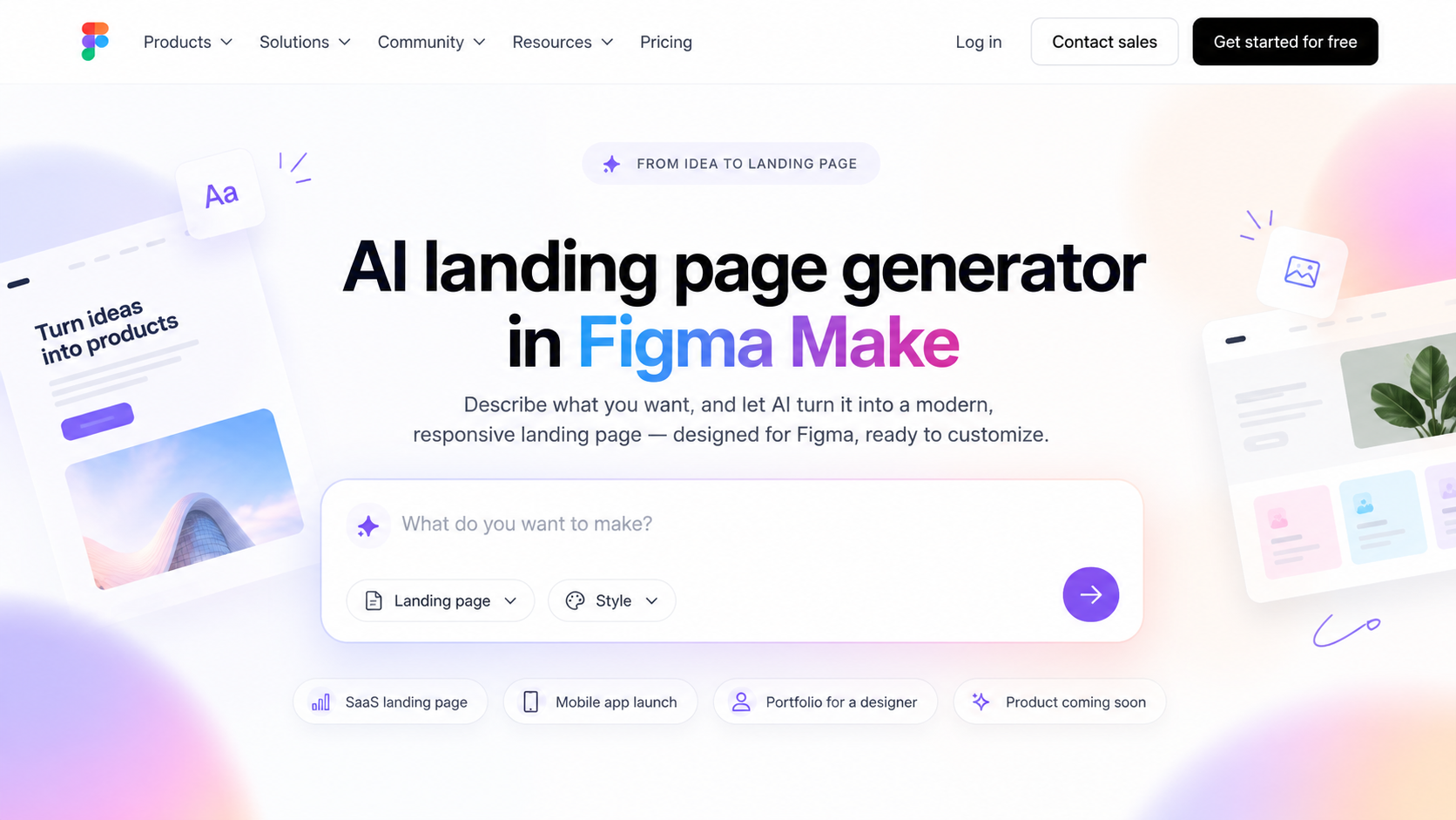
Figure 5. Figma’s solution page presents landing-page generation within Figma Make. Original page screenshot.
When comparing the best AI landing page generator 2026 options, assess the whole task: applying your brand, finishing the form, connecting its destination, and maintaining the result. A specialist campaign tool may suit a straightforward signup; an app workspace may give you more room for custom eligibility rules or an accompanying dashboard.
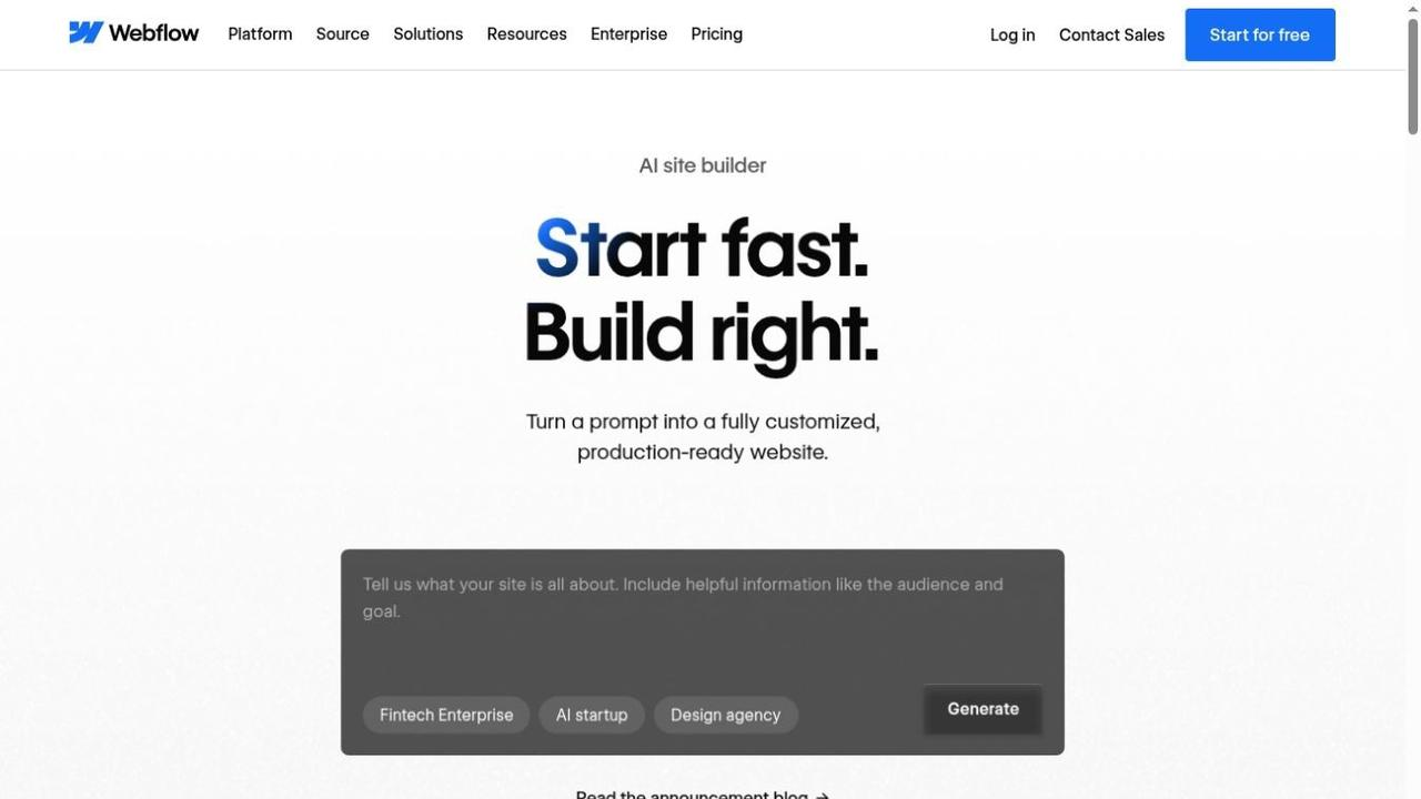
Figure 6. Webflow asks for the site's audience and goal inside its main prompt area. Original page screenshot; captured 8 October 2026.
Do not treat an integration logo as proof that your exact workflow is supported. Check the field mapping, destination object, authentication method, and failure handling. Sending an email address to a mailing list is not the same operation as creating a sales lead with its campaign source and qualification fields.
Why Enter Pro Goes Beyond a Basic AI Landing Page Generator
I used Enter Pro to develop HandoffFlow, a fictional incident-handoff SaaS page, through a plan, a mobile preview, a focused revision, and form review. Keeping those stages in one project made it easier to compare the output with the same brief.
The practical benefit was an editable implementation that I could keep refining. The captures document that progression; they also identify the remaining delivery checks. You can use Enter Pro’s app-building workspace to follow the same process with your own approved offer.
How to Make a Landing Page with AI in Enter Pro
The seven steps below follow the same HandoffFlow project. I prepared one campaign brief and used focused follow-ups for generation, refinement, and submission handling. Each capture records a different stage of the work.
Step 1 — Write the Campaign Brief
I defined operations leads at SaaS companies with 50–200 employees as the audience, a LinkedIn ad about clearer incident handoffs as the traffic source, and a 30-minute product demo as the offer. The main action was “Request a demo.”
The first capture shows that brief prepared with Plan mode enabled. I also required a five-field form and prohibited invented customers, testimonials, statistics, and test results. A specific brief gives an AI landing page builder a more useful starting point than a request for a modern-looking page.
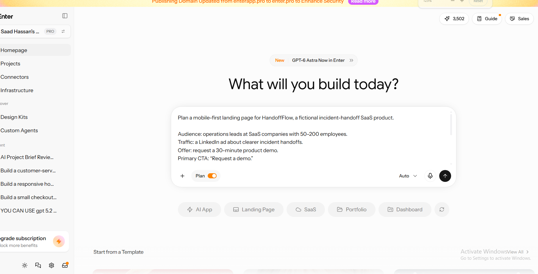
Figure 7. The HandoffFlow campaign brief is prepared in Enter Pro with Plan mode enabled. The visible text defines the audience, traffic source, offer, and CTA.
Step 2 — Plan the Information Sequence
The resulting plan identifies the existing homepage route, the application template, the campaign context, and the intended page structure. It records English-only copy, an honest proof placeholder, and CTAs that lead to the on-page demo form.
The decisions also include saving submissions to the project database. That makes storage part of the intended workflow from the planning stage. I would review that destination alongside the information sequence before approving the build; a plan specifies the work but does not establish that it is complete.
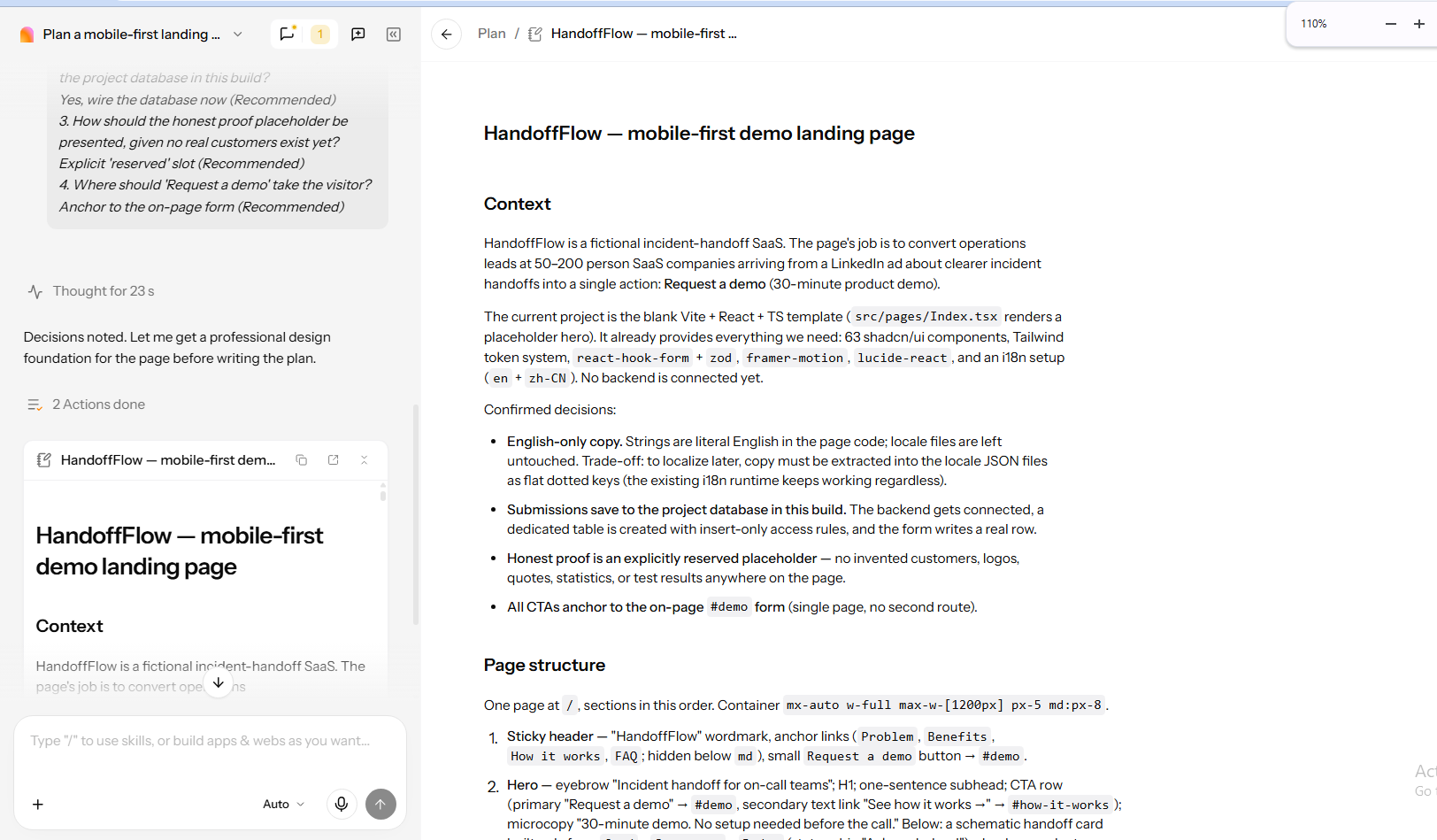
Figure 8. The project plan records database submissions, a reserved proof placeholder, and CTAs that anchor to the demo form. These are planned decisions.
Step 3 — Generate One Focused, Mobile-First Page
The first narrow preview uses the headline “Handoffs that keep the thread,” followed by an explanation of the incident record and a prominent “Request a demo” button. A sample handoff card makes the proposed product mechanism easier to inspect.
This view lets me assess the visible hierarchy at a narrow width: headline, explanation, action, and example. I would still check scrolling, keyboard access, and form behavior on a real phone. A responsive-looking preview is useful evidence of the layout, while those interactions need their own checks.
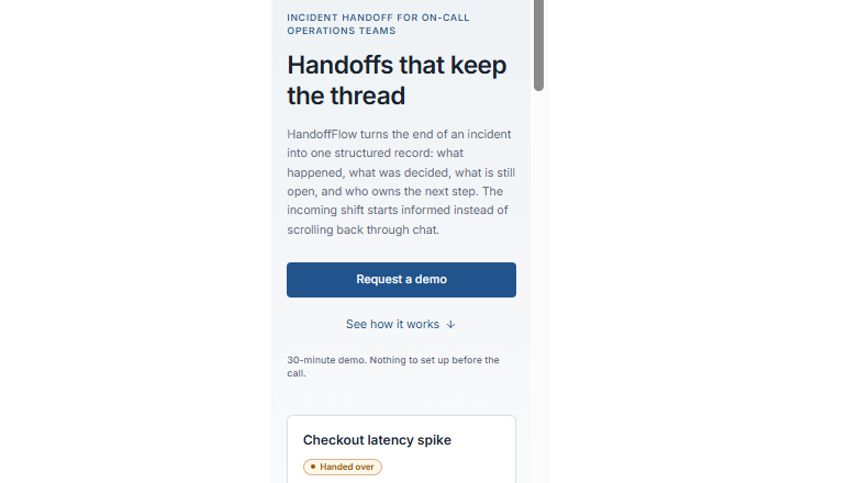
Figure 9. The initial narrow preview shows the original headline, demo CTA, and illustrative handoff card. It documents the visible mobile layout.
Step 4 — Refine the Page Visually
My follow-up changed the headline to “Keep Every Incident Handoff Clear,” requested more space around the CTA, and asked for a single-column form on narrow screens. I kept the offer and section order in the instruction so the revision had a contained scope.
The capture shows the submitted refinement and the updated headline together. Enter’s response reports checks at 390px and 768px. This was a prompt-based revision; the visible comparison supports the headline change without implying that I used a separate visual editing tool.
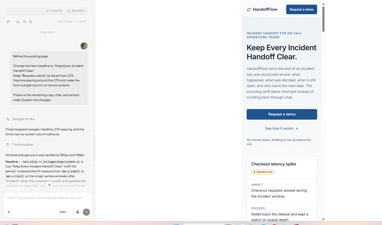
Figure 10. The refinement request and updated headline appear in the same project. Enter’s response reports changes to headline, CTA spacing, and narrow-screen form layout.
Step 5 — Connect the Real Workflow
The next stage concerns the form’s destination. The preview contains full name, work email, company, company size, and role. Enter’s response reports a connected backend, a deployed submission function, and database checks, including rejection of invalid payloads.
That report also says its verification rows were deleted afterwards and email notifications are not connected. The picture shows the filled form and the report, rather than a saved database row or completed browser submission. Before using this for sales, I would inspect one retained valid record and arrange who receives the request.
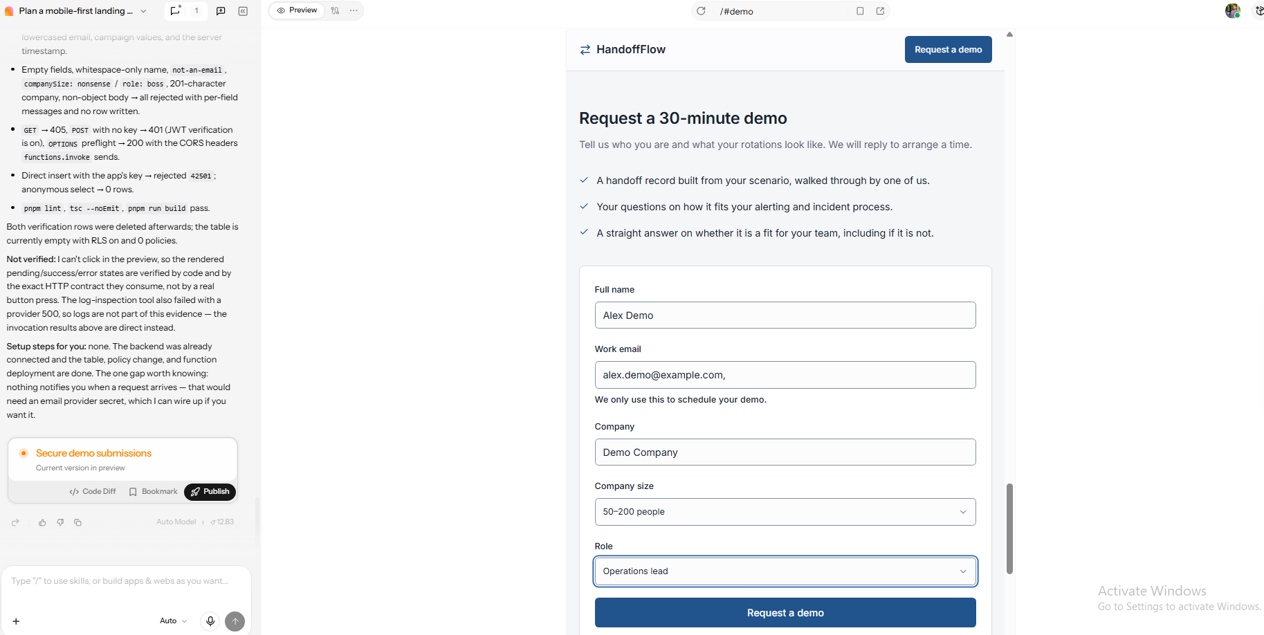
Figure 11. The five-field form appears beside Enter’s implementation and verification report. The report notes missing email notifications; no saved record is visible here.
Step 6 — Run the Prelaunch Review
The captured validation state leaves Company empty and displays “Enter your company name.” The name, email, company size, and role remain visible. That is a useful result: the form identifies the field that needs attention while preserving the other displayed answers.
I would next check invalid email, repeated clicks, and a failed request separately. Enter’s report explicitly distinguishes endpoint and code checks from browser-button testing. The visible company error supports that particular validation state; it does not establish that every success, pending, or recovery path passed.
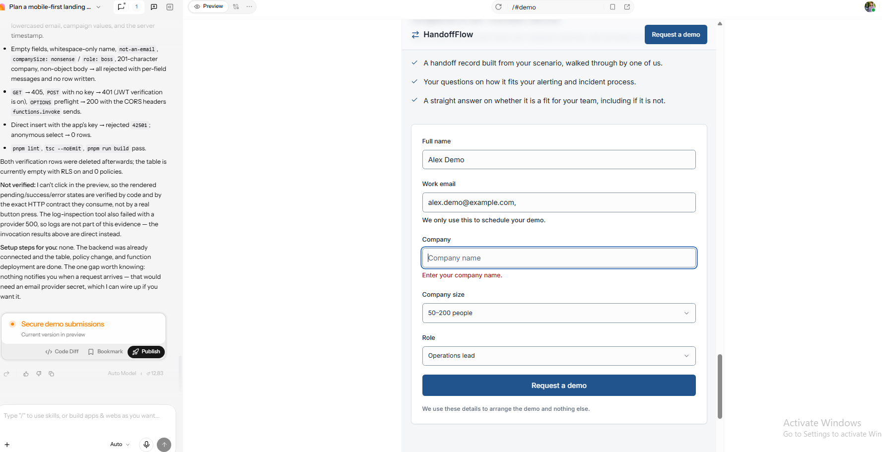
Figure 12. An empty Company field produces “Enter your company name” while other visible values remain. This is a captured required-field validation state.
Step 7 — Publish, Measure, and Improve
The final capture shows HandoffFlow open at a public Enter production URL. Its desktop layout places the demo explanation beside the form, with fields filled and the submit button visible. This establishes that the page was published and accessible in that browser session.
The picture does not contain a submission success message, stored lead, or analytics event. My next check would follow one valid live request into the database and its follow-up destination. Once that works, record the release and use a measured campaign to evaluate a headline or form change. For repository handoff, review Enter’s GitHub connection guide.
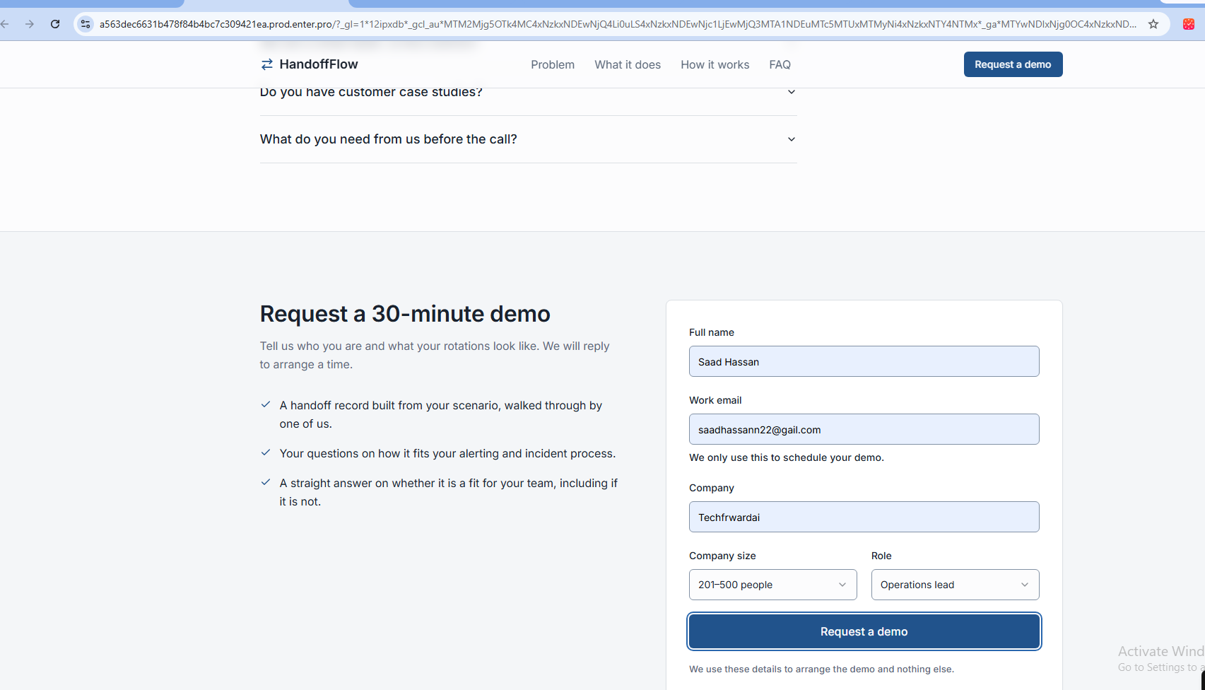
Figure 13. The published HandoffFlow page is open at its public URL with the form filled. A successful submission, stored record, and tracking event are not shown.
A Strong AI Prompt Starts with the Campaign Brief
A useful prompt reduces the decisions the tool has to invent. When you are learning how to make a website with AI, describing the visitor’s task is a stronger starting point than appearance alone. HandoffFlow’s brief names the audience, incoming promise, demo offer, and intended submission destination.
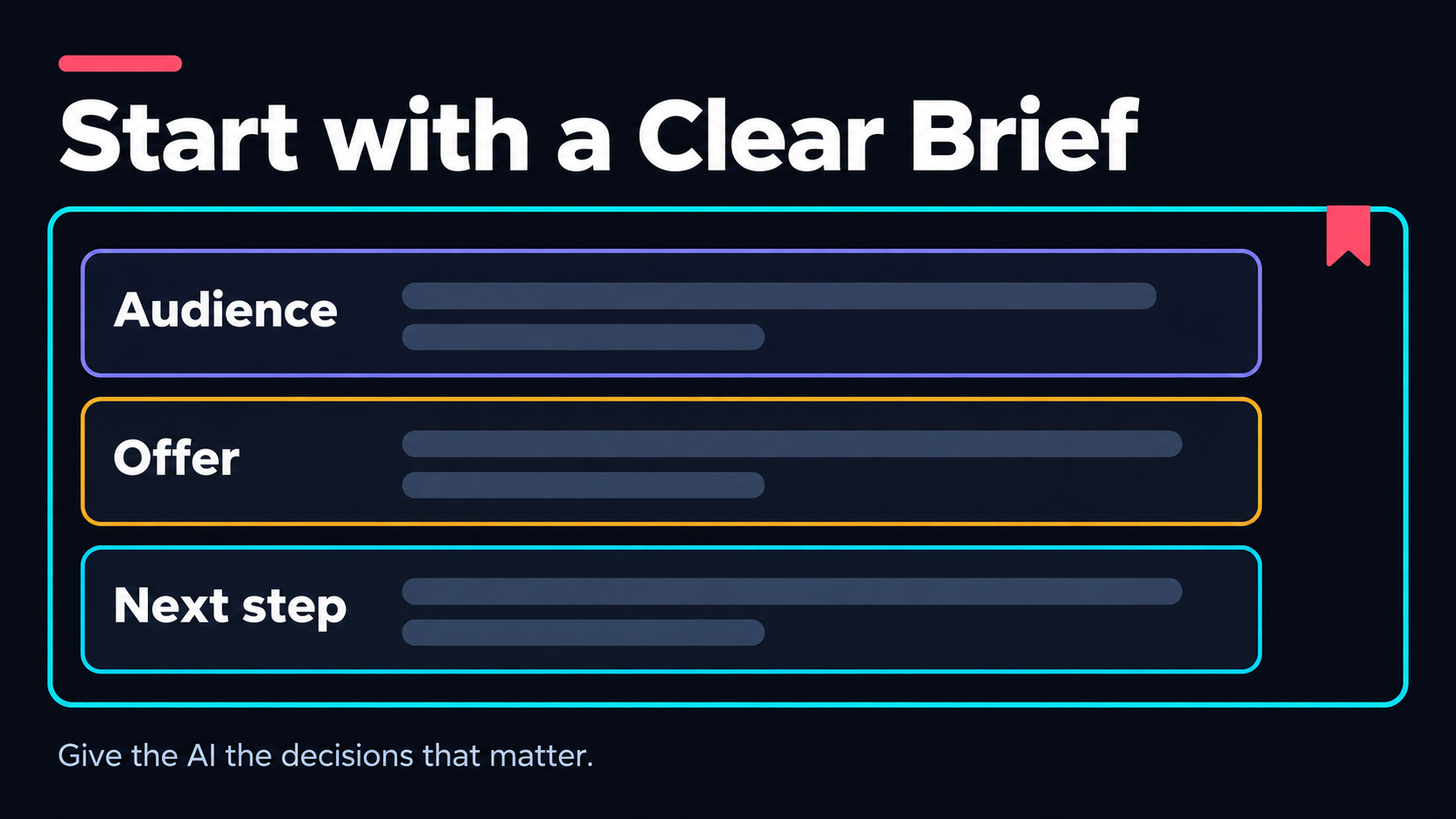
Figure 14. Give the AI the audience, offer, and intended next step before choosing a visual direction. Concept illustration.
Here is an adapted planning prompt based on that walkthrough:
Plan a mobile-first landing page for HandoffFlow, a fictional incident-handoff SaaS product.

Audience: operations leads at SaaS companies with 50–200 employees.

Traffic: a LinkedIn ad about clearer incident handoffs.

Offer: request a 30-minute product demo.

Primary CTA: Request a demo.

Sections: hero, problem, benefits, how it works, honest proof placeholder, FAQ, and form.

Form: full name, work email, company, company size, and role.

Save submissions to the project database through server-side handling.

Do not invent customers, testimonials, statistics, or test results.

Give me the plan first. Report implemented work separately from checks actually executed.
Review the plan before generating the page. Check that it preserves the audience, the requested action, the five fields, and the restrictions on proof. Then ask for the implementation. This gives you an explicit reference when comparing the result with the brief.
Keep the next request focused on a change you can inspect. In HandoffFlow, I revised the headline and spacing, then reviewed the form’s submission handling. Separating those stages made the visible changes easier to identify.
What a High-Converting Landing Page Still Needs After AI Generation
An AI landing page generator can assemble persuasive-looking sections without knowing whether the underlying promise is true. I review the page as a sequence of decisions: understand the offer, believe the relevant claim, judge the commitment, and complete the action.
Keep the Offer and Proof Specific
For HandoffFlow, the offer is a request for a 30-minute product demo. The form copy says a reply will arrange a time. Treat that wording as a follow-up commitment to implement, not evidence that notification or scheduling already works. A request should only become a confirmed booking after that separate action is completed.
Calendly's page promises a product tour and places the form beside that promise. Its button says Continue, which describes progression through the flow. I would keep the same distinction in your page: a tour request, a sales request, and a confirmed meeting are different outcomes.
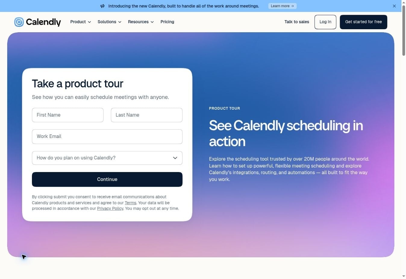
Figure 15. Calendly pairs the product-tour promise with name, work-email, and intended-use fields. Original page screenshot; captured 8 October 2026.
The plan reserves a proof placeholder because HandoffFlow is fictional. For a real campaign, replace that slot with something you can substantiate: an approved product screen, a genuine testimonial, or a measured result with its context. Keep illustrative handoff content clearly separate from customer evidence.
Unbounce’s 2024 Conversion Benchmark Report analyzed more than 41,000 landing pages and 464 million unique visitors, reporting an overall median conversion rate of 6.6%. That historical platform dataset offers context for comparison; it is not a result from HandoffFlow or a universal target for your campaign.
Make the Form Easy to Complete and Recover
Every required field should have a purpose. Company size may qualify a sales demo; a phone number may be unnecessary for a downloadable checklist. You can improve lead quality and still create avoidable friction, so I would review each field against the actual follow-up process.
Shopify's trial page begins with one email field and puts its marketing-email notice next to the action. That gives you a useful contrast with the five-field demo form: collect information for the commitment you are offering, then qualify further when the workflow requires it.
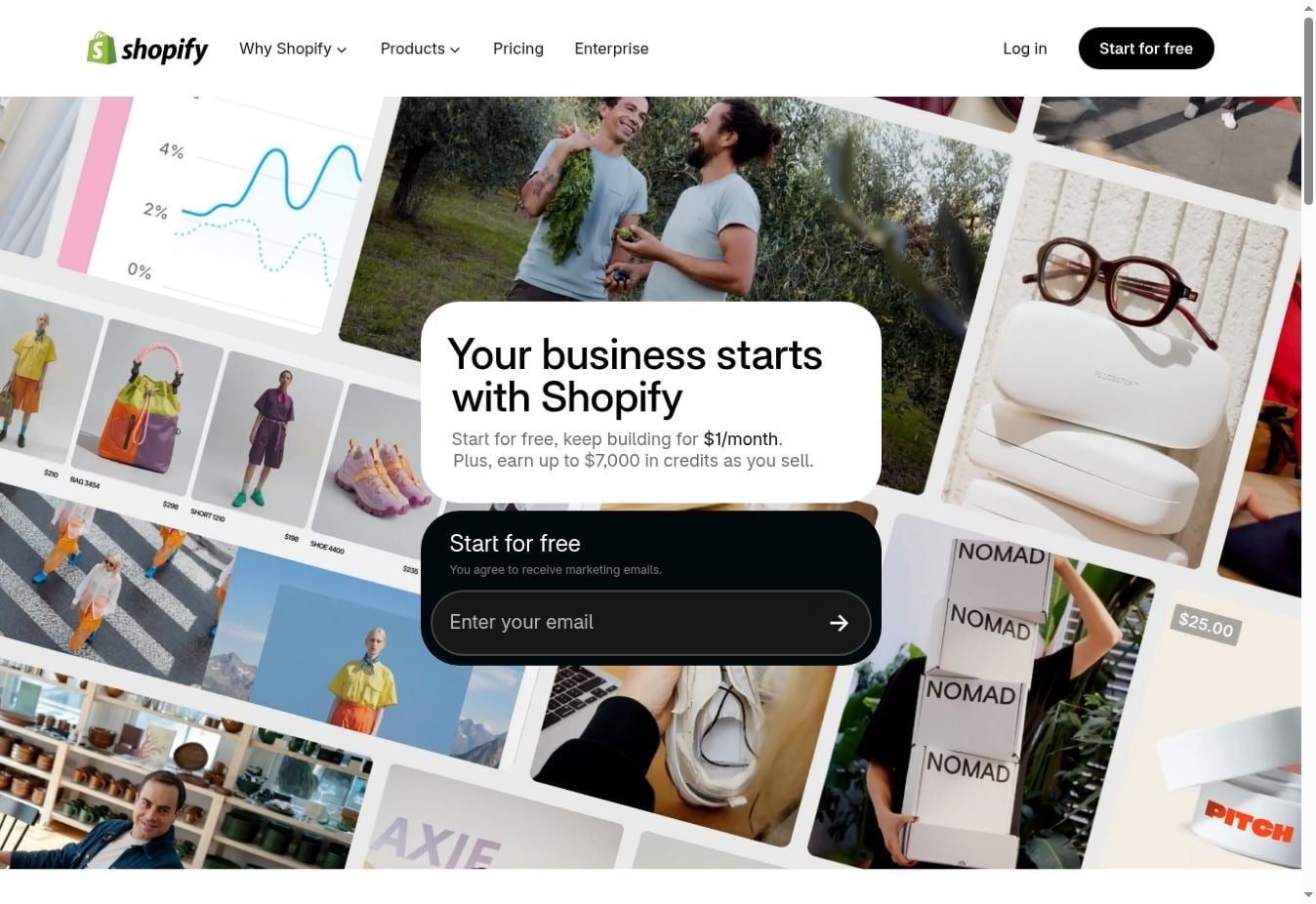
Figure 16. Shopify starts this trial flow with one email field. The displayed offer is specific to the captured page, not a universal pricing promise. Captured 8 October 2026.
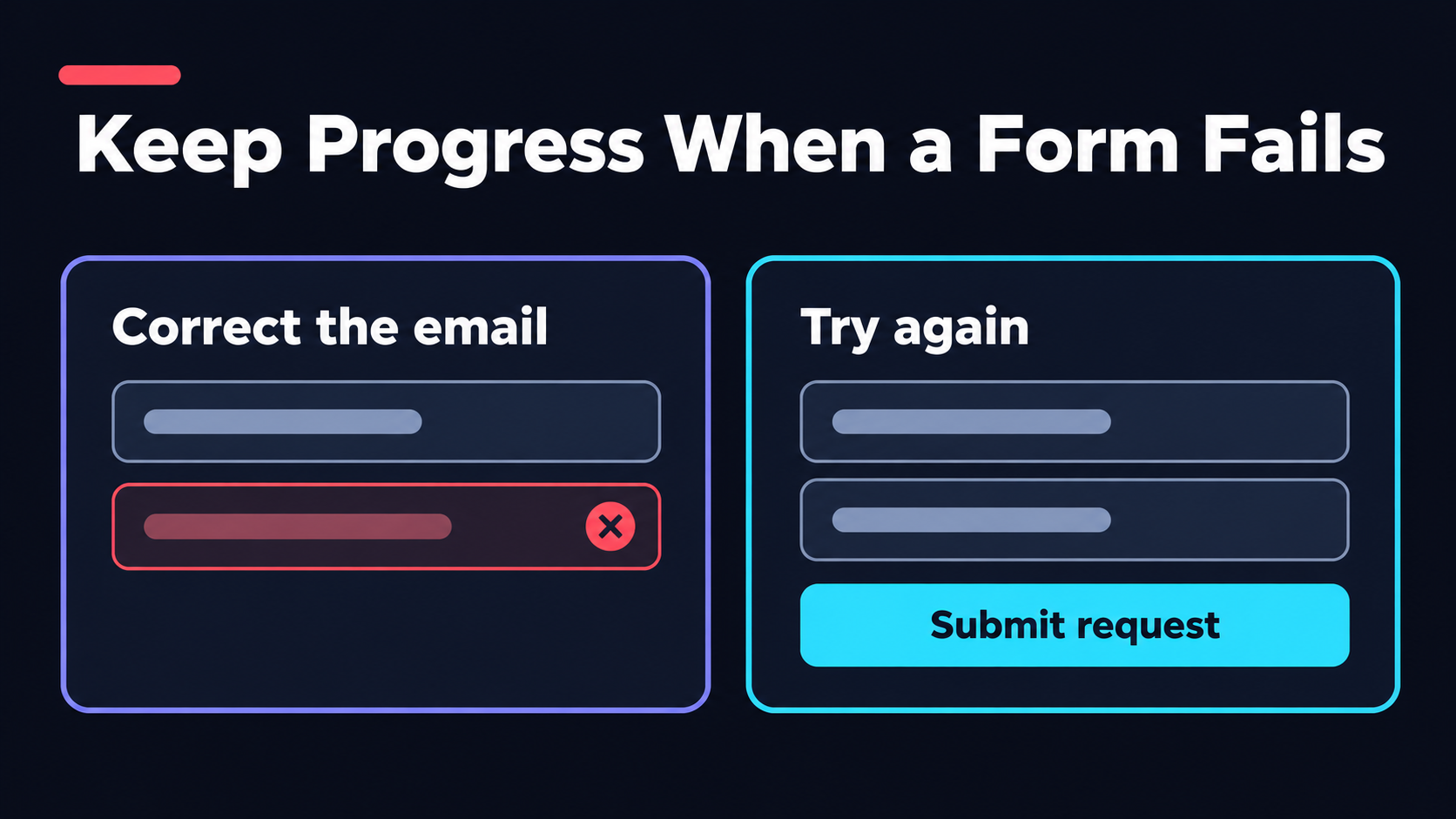
Figure 17. Keep entered values available when the visitor corrects an email or retries a failed request. Concept illustration.
Show labels before someone starts typing. Use appropriate input types and autocomplete values, then explain constraints beside the affected field. An email-format check can catch a missing domain; it cannot prove that the mailbox exists or belongs to the intended business contact.
Your server should validate the submitted payload too. A browser's required-field rules are useful feedback, but requests can arrive without passing through that browser interface. You also need to avoid duplicate records when someone retries after an uncertain response.
Free AI Landing Page Generators Come with Real Limits
A free AI landing page generator can be enough to explore an offer or build a first draft. My first question is what remains available when the trial ends: temporary access and an ongoing free plan are different commitments. Your page may stay visible while an editing or integration feature changes.
MailerLite’s free-plan limits, checked on 9 October 2026, include 250 subscribers, 2,500 monthly emails, and one website plus one landing page. This is a concrete example of why “free” should be evaluated against campaign volume and workflow, as well as the ability to create a page.
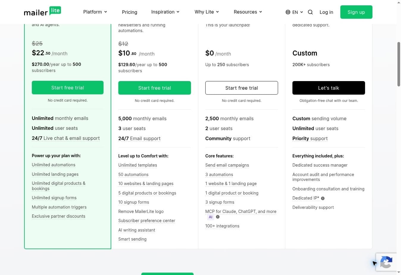
Figure 18. MailerLite's pricing page lists a $0 plan with subscriber, email, and page limits. Captured 8 October 2026; allowances can change.
| Limit to inspect | Why it matters before launch |
|---|---|
| Domain and branding | Your campaign may need a branded URL and consistent presentation |
| Published pages | Multiple offers or variants can exceed a single-page allowance |
| Credits or editing allowance | Revisions may consume capacity after the initial generation |
| Subscribers and submissions | Growth can trigger a plan change or interrupt the workflow |
| Integration access | The connection you need may depend on a paid plan |
| Export and account continuity | You need a maintenance route if the subscription changes |
You do not have to buy the largest plan immediately. Calculate the minimum configuration that supports your campaign, including hosting, delivery, and measurement. For me, a necessary workflow takes priority over decorative extras, especially when advertising costs dwarf the builder subscription.
Measure the Funnel, Not Only the Page View
The best landing page builder for your campaign should let you measure the action you actually value. A page-view counter cannot tell you whether the form worked. I define the conversion before launch and reconcile that event with what reaches the destination.
| Stage | What it tells you | Common misleading signal |
|---|---|---|
| Page visit | Someone reached the campaign page | Internal previews counted as visitors |
| Form start | Someone began entering information | A focus event mistaken for meaningful intent |
| Accepted submission | The application accepted a valid request | A button click counted before validation |
| Destination record | The agreed system received the lead | A success animation with no stored record |
| Qualified response | The lead progressed to the next business step | Every submission treated as equally valuable |
Google Analytics documents generate_lead for an actual lead-generating action, such as a completed form. Your implementation still has to send the event at the correct point. I would not fire it on the first CTA click, which can happen without a valid submission.
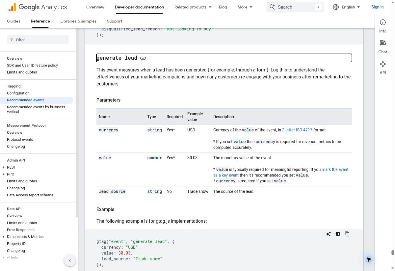
Figure 19. Google's recommended event describes lead generation, not merely pressing a button. Official documentation captured 8 October 2026.
Compare Results Within a Consistent Campaign
Keep the traffic source, offer, and reporting window visible when comparing versions. If one page receives warm email traffic and another receives cold ad clicks, their raw conversion rates do not isolate the page's effect. You should also distinguish test submissions and repeat requests from genuine campaign leads.
For the HandoffFlow demo, I would establish a valid saved request and a follow-up owner before comparing analytics totals. In a working campaign, a gap between submission events and destination records may indicate event timing, duplicate retries, rejected mappings, or delivery failure. Investigate that operation before changing the hero.
Performance and Accessibility Are Launch Requirements
HandoffFlow’s narrow preview and published desktop capture show two visible layouts. They do not establish speed or accessibility scores. I would check the public page with real content, third-party scripts, and the final form; the AI landing page generator’s initial rendering is only part of the released experience.
Use Measurable Performance Checks
Google's Core Web Vitals define good performance as LCP ≤2.5 seconds, INP ≤200 milliseconds, and CLS ≤0.1, evaluated at the 75th percentile of page loads. These measure loading, responsiveness, and visual stability. They are not a guarantee that the offer will convert.
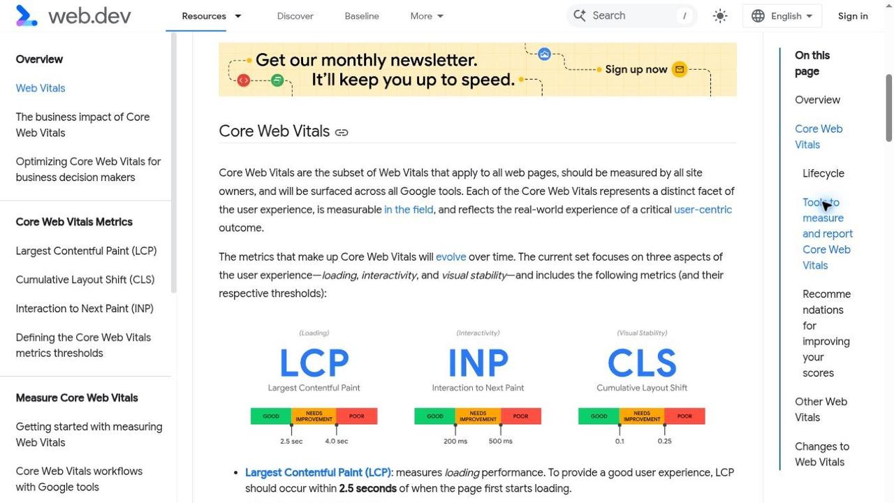
Figure 20. web.dev's official thresholds distinguish loading, interaction responsiveness, and layout stability. Source capture: 8 October 2026.
Lab tests help identify problems before launch; field data reflects actual visits. A new page may not have enough field data yet. You can still inspect large hero assets, delayed form scripts, and shifting content, then monitor real traffic as observations accumulate.
Check Reading and Interaction Access
The WCAG contrast requirements specify 4.5:1 for normal text and 3:1 for qualifying large text at Level AA. I would check the hero, field labels, placeholder text, and errors rather than testing only the main button. Attractive muted text can become difficult to read.
Use the keyboard through the complete form and keep focus visible. Errors should identify the affected field without relying on color alone. You should also review zoomed text and mobile input behavior; a successful contrast check covers one requirement, not the whole accessibility experience.
Final Take: Choose an AI Landing Page Generator You Can Test
I would choose an AI landing page generator by the work I can verify: communicate the offer, edit the result, capture a valid request, and confirm the next step. When comparing the best AI landing page generator 2026 options, apply those same acceptance checks to each candidate.
The HandoffFlow walkthrough shows planning, a focused headline revision, a required-field error, and a published page. Enter reports backend checks, while saved-record inspection, browser submission success, notifications, and measurement remain work to verify. You can use Enter Pro to build and refine your own landing page, then follow a live test request through its actual destination before expanding the campaign.
Frequently Asked Questions About AI Landing Page Generator
Can AI Build an Entire Landing Page From One Prompt?
It can generate a substantial first version, sometimes including interactions and code. The amount completed depends on the tool and brief. You still need to verify claims, data handling, and publishing configuration before treating the output as a working campaign.
Is a Free AI Landing Page Generator Enough for a Paid Campaign?
It can be, if the ongoing plan supports your domain, expected volume, and delivery workflow. I would test the live submission path and check trial expiry before buying traffic. A free draft that cannot handle the campaign's next step is not sufficient.
How Can I Use Enter Pro as an AI Landing Page Generator?
Define the audience, traffic source, offer, primary CTA, sections, and required form fields. Ask Enter Pro to plan the page before generating it. Review the mobile layout, refine the messaging, and connect the form to its intended destination. Use approved product information and verifiable proof.
What Should I Test Before Launching an Enter Pro Landing Page?
Submit valid and invalid entries on the published page. Confirm that accepted submissions create the expected records and that errors preserve entered information. Verify any notification or CRM connection, check retry behavior, and confirm that conversion tracking records a successfully accepted lead.
Should I Use a Landing Page or a Full Website?
Use a landing page when one offer and one action can serve the incoming visitor. Use a broader website when people need to explore multiple services, products, or resources. You can keep campaign pages focused while linking to necessary privacy and business information.
Can I Edit an AI-Generated Page After Publishing?
Many builders support ongoing edits, but the editing and deployment model varies. Check whether you can update the page in the same workspace, inspect the code, or use a repository. Keep the previous version available before publishing a significant change.
What Is the First Metric to Inspect After Launch?
Start with the action your campaign promises, then verify the destination record. For a demo request, compare accepted submissions with delivered leads. I would resolve a discrepancy there before drawing conclusions from traffic or changing the page's messaging.
How Many Form Fields Should I Request?
Ask for what you need to fulfill or qualify the offer. A sales demo may justify company and role fields; a simple signup may not. There is no universal best count. You should be able to explain how each required answer is used.
Will AI-Generated Landing Pages Rank in Search?
AI generation does not guarantee rankings. A search-focused page needs useful, accurate content, appropriate indexability, and relevance to the query. A paid-campaign page may have a different purpose. Decide that purpose before expanding it with unrelated material purely for length.
Can I Learn How to Make a Website With AI Without Design Experience?
Yes. Start with a specific audience, offer, and action, then review each generated section against the brief. You can learn layout and copy through focused revisions. For custom data handling, arrange implementation review rather than assuming the visible interface establishes correctness.