

How to Apply Best Practices for UI Design, With Real Examples
Learn the best practices for UI design with 15 proven rules, real product examples, mobile app UI design tips, and UI design tools to build clearer interfaces.
Best practices for UI design are proven guidelines that make an interface easy to understand and navigate. These principles encompass simplicity, clear hierarchy, consistency, feedback, accessibility, responsive layouts, and testing. By following these rules, users can easily determine what to click next without confusion.
In this blog, we will explore what UI design is, present 15 essential rules accompanied by real product examples, provide tips for mobile design, recommend useful tools, and offer a checklist for your reference. Each principle is drawn from reputable sources, including Figma, Nielsen Norman Group, WCAG, UX Pilot, and Erik Kennedy. We did not conduct our own testing.
Ready to transform these principles into effective user interfaces? Jump to the "Enter Pro" section.
What Is UI Design?
UI design involves creating the visual and interactive components of digital products. This includes elements like buttons, menus, forms, typography, colors, spacing, and layout. UI design applies to a variety of platforms, such as websites, apps, and software.
UI Design vs. UX Design
User experience (UX) shapes the complete journey, while user interface (UI) highlights what users see and interact with. As Thomas Lowry from Figma points out, think of it as signposts: help users navigate without forcing them to memorize the route.
| UI design | UX design | |
|---|---|---|
| Focus | How screens look and respond: layout, color, type, buttons | How the whole experience works, from first click to goal |
| Deliverables | Style guides, component libraries, mockups, prototypes | User research, journey maps, flows, wireframes |
| Question | “Can people see, understand, and use this screen?” | “Does this product solve their problem?” |
The Building Blocks of an Interface
Every interface is built from a small set of parts. Knowing the four main families makes it easier to spot what a screen needs, and what it doesn’t.
- Input controls: let people enter or choose something, like checkboxes, toggles, dropdowns, and text fields.
- Navigation: helps people move around, like tab bars, menus, breadcrumbs, and search.
- Information displays: show people what’s happening, like tooltips, notifications, progress bars, and badges.
- Containers: group related content, like cards, modals, accordions, and sidebars.
15 UI Design Best Practices
These essential UI design best practices focus on capturing users’ attention right from the start. They also emphasize the importance of fostering continuous improvement within teams.
Simplify: Remove, Hide, Shrink, Organize
Ask four questions, in order. Can we remove it? Hide it until needed? Shrink it? Only then, organize it. Netflix’s home screen leans on artwork and one clear Play action. Forms work the same way. If we only need an email, there’s no reason to ask for “address line two.” Just don’t bury core features. Test that people can still find them.
Build a Clear Visual Hierarchy
Size, weight, contrast, and spacing tell people what to read first. In Figma’s example, a red “delete account” button pops on a white screen, while “keep account” stays gray. The eye knows where to go. Here’s a quick check: squint at the screen and see what stands out. If everything is loud, nothing is.
Use Whitespace Generously
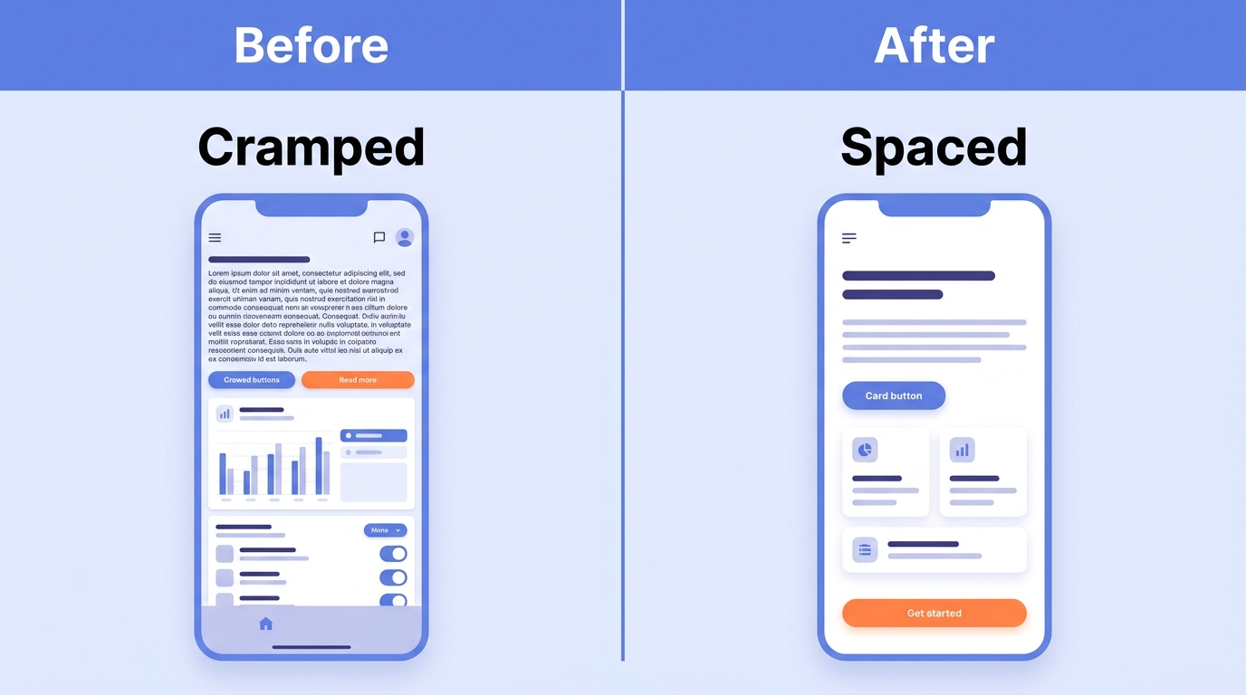
Cramped layouts look undesigned, says Erik Kennedy. Space gives each element room to breathe and makes the page feel calmer. His music-player example uses about 12px menu text with similar padding above and below, and a 15px gap between a heading and its underline. Treat those numbers as heuristics, not laws.
Design in Grayscale First, Then Add Color With Purpose
Kennedy starts in black and white, so spacing and structure carry the design. Color comes later and has a job to do. Add one color, then build variations by changing only its saturation and brightness. Keep shadows consistent too, as if the light comes from above. Need palette ideas? Try Coolors.
Keep Everything Consistent With a Design System
Consistency comes in four types: visual, functional, internal, and external. Slack Kit is a good example. It keeps Slack’s desktop, web, and mobile apps feeling alike. Figma reports that teams with a design system finished 34% faster. No system yet? Start with a simple style guide, then grow it into reusable components.
Follow Familiar Patterns
Cart icons, hamburger menus, and hearts already carry meaning. People don’t have to learn them. On the iPhone, swiping right usually means back, so remapping it to delete fights muscle memory. Break a convention only when you have a tested reason, and keep the change small.
Make Navigation Intuitive and Favor Recognition Over Recall
Show options. Don’t make people remember them. Amazon’s recently viewed list and autocomplete beat a blank search box every time. Add orientation cues too, like where you are and how many steps remain. Keep menus shallow and labels plain.
Give Immediate Feedback for Every Action
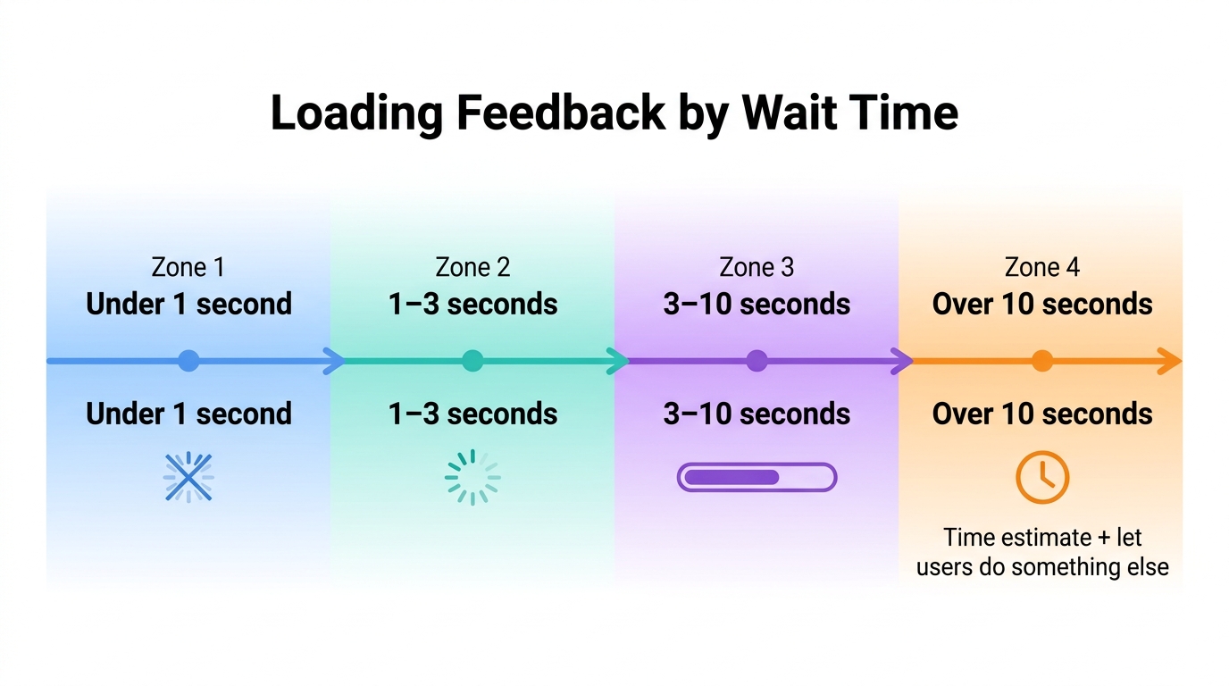
Every tap deserves a response. Feedback comes in three forms: instant reaction, system status, and outcome confirmation. Gmail’s undo send holds a message briefly so people can reverse a mistake. For waits, UX Pilot’s rule lines up with Nielsen Norman Group’s limits: nothing under 1 second, a spinner for 1–3, a progress bar for 3–10, and a time estimate beyond that.
Prevent Errors and Design Forms That Convert
The best error message is the one nobody sees. Use constraints, smart defaults, inline validation, confirmations for destructive actions, and undo. Agoda and Trip.com gray out impossible dates, so people can’t pick them by mistake. Always use visible labels. Placeholder-only fields vanish the moment someone starts typing.
Write Clear Calls to Action
Give each screen one primary action. People shouldn’t have to wonder what to click. Use verb-led labels: “Start free trial,” not “Submit.” Keep the placement consistent from screen to screen. Too many loud CTAs cancel each other out.
Design for Accessibility From the Start
Follow WCAG’s POUR principles: perceivable, operable, understandable, and robust. The AA contrast minimums are 4.5:1 for body text and 3:1 for large text. Good contrast helps everyone, including anyone reading a phone in bright sunlight. Check your work with WAVE or axe.
Build Responsive, Mobile-First Layouts
Start with the most constrained screen, then enhance for larger ones. It’s the same idea as Kennedy’s grayscale-first method. Solve the hard problem first. UX Pilot cites Walmart’s mobile-first rebuild as an example. Check the mobile section below for tap targets and thumb reach.
Optimize Performance and Perceived Speed
Speed is part of the interface. Compress images, lazy-load off-screen content, and use skeleton screens, so wait feels shorter. Google’s Core Web Vitals give clear targets: Largest Contentful Paint under 2.5 seconds, Interaction to Next Paint under 200 ms, and Layout Shift under 0.1.
Test With Real Users Early and Often
Nielsen Norman Group finds that about five users surface roughly 85% of usability problems in one qualitative round. That’s per round, not a guarantee. Airbnb’s founders spotted poor listing photos by watching real behavior. Early tests are cheap. Late fixes aren’t.
Keep Improving With Data and Feedback
Launch isn’t the finish line. Close the loop: analytics, a hypothesis, a test, a release. Gymshark saw shoppers leave checkout to find sizing and reviews, then added that information inside the flow. One rule keeps results readable: change one thing at a time.
Best Practices for Mobile App UI Design
Create an interface designed for thumbs, using generous tap targets for effortless interaction. Embrace platform conventions to meet user expectations, reduce the need for typing to enhance efficiency, and prioritize a swift, responsive experience to keep users engaged.
Design for Thumbs: Reach Zones and Tap Targets
Most people use their phones with one hand. That means you should put the things they use right where their thumb can easily reach. Make buttons big enough so they can tap them without aiming hard. Apple says 44 by 44 points is good. Google’s Material Design says 48 by 48 dp. Uber does this well. It fills in the pickup location using GPS. It keeps the "Where to?" button close to the thumb. It’s simple and helps a lot.
Follow Platform Conventions on iOS and Android
People already know how their own phone works. iOS favors a tab bar and a back swipe. Android leans on a navigation drawer and the system back button. Use each platform’s native patterns unless testing gives you a clear reason not to.
Cut Typing and Respect Context
Typing on a phone is slow, so skip it wherever you can. Use autofill, pickers, the right keyboard type, and biometric sign-in. Ask for permissions at the moment they’re needed, and add one line explaining why. People say yes more easily when the reason is clear.
Design for Real Conditions
Phones live in messy conditions: slow networks, small and large screens, one-handed use. Plan for all of them. Test on real devices, not only emulators, because emulators miss the quirks people actually hit. For layout basics, see our mobile responsive website guide.
UI Design Tools: What to Use at Each Stage
No single tool wins at every stage. Pick by the job you need done, not by a “best” label. Also check each tool’s current pricing and plan limits on its own site before you commit.
| Tool | Best for | Pick it when | Watch out for |
|---|---|---|---|
| Figma | Collaborative design and prototyping | Several people need to design, comment, and test flows together | Free and paid plans have limits, so check what your team needs |
| Sketch | Vector design on macOS | Your whole team works on Macs and wants a focused design app | Mac only, which can be a problem for mixed-OS teams |
| Penpot | Open-source design | You want an open-source option you can control | Confirm that the features you rely on are available |
| Framer | Going from design to a published site | You want to design a page and put it live in one place | Your site lives on Framer’s platform, so moving later takes work |
| Enter Pro | Turning prompts into React and Tailwind UI | You want the working screens fast, without drawing each one first | Review the generated code and layouts before you ship |
UI Design Checklist: Audit Any Screen in 10 Minutes
Run through this list on any screen. It takes about 10 minutes, and each failed check points to the practice that fixes it.
| Check | Pass condition | Practice # |
|---|---|---|
| Primary action | There is one clear primary action per screen, and it is easy to spot | 10 |
| Hierarchy | When you squint, the most important element still stands out | 2 |
| Spacing | Padding and gaps follow a consistent pattern, with no cramped areas | 3 |
| Text contrast | Body text is at least 4.5:1, and large text is at least 3:1 | 11 |
| Tap targets | Targets are at least 44×44 pt (iOS) or 48×48 dp (Android) and sit within thumb reach | 12 |
| Feedback | Every tap, swipe, or submit gets a visible response | 8 |
| Forms | Fields have visible labels, errors show inline, and destructive actions ask for confirmation | 9 |
| Keyboard | Every control can be reached and used with the keyboard alone | 11 |
| Load speed | Skeleton screens, spinners, or progress bars appear while content loads | 13 |
| Real users | The screen has been tested by real users this quarter | 14 |
How to Build These Interfaces With Enter Pro
Unlock the power of Enter Pro, which transforms natural language prompts into seamless React and Tailwind UI. Follow these steps to effortlessly build your screen while implementing best practices along the way.
Step 1: Start a Project in Your Workspace
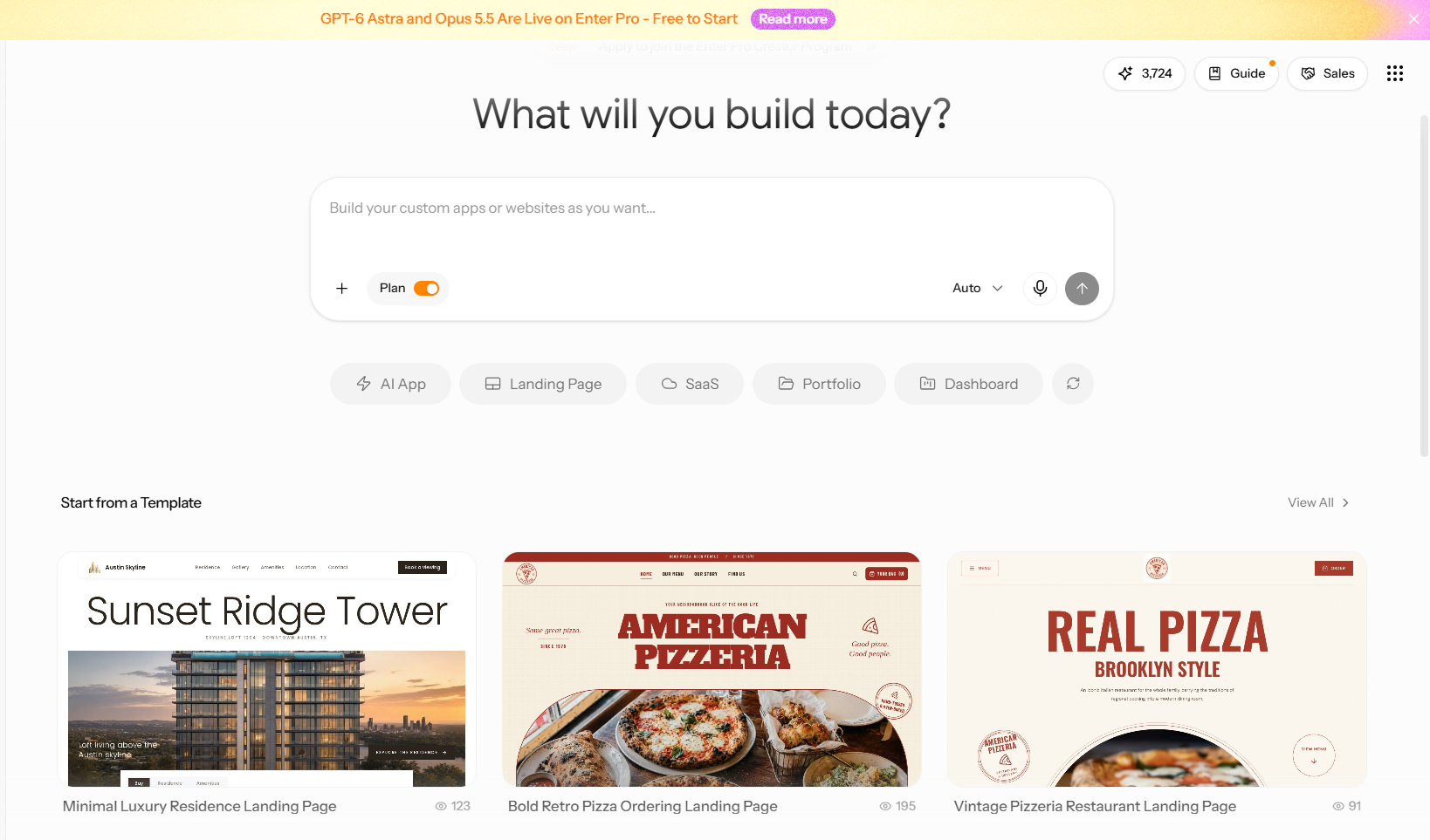
Log in to your Enter workspace and start a new project. You can open a blank project, or pick a community template if you’d rather start from something that already exists.
Step 2: Describe Your Screens, Flows, and Design Preferences
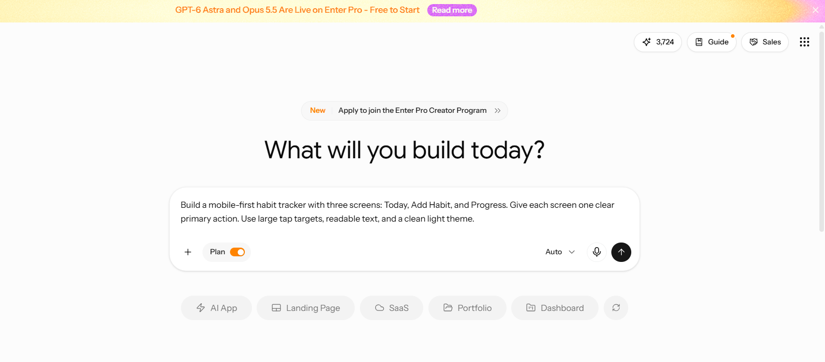
Write your prompt in plain language. Cover three things: the screens, how people move between them, and the style you want.
Step 3: Review the Generated Code
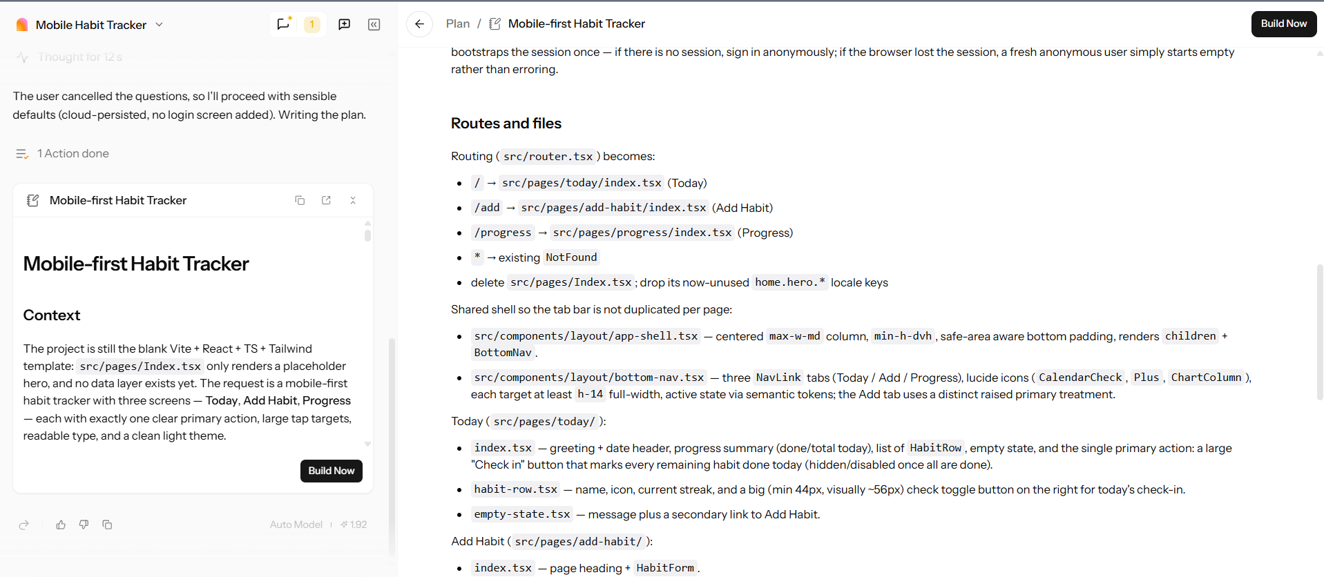
Before you touch the design, open the React and Tailwind code Enter generates. Check that components are reused, the markup is semantic, labels and alt text are in place, and nothing is hard-coded. That should be a shared style. If everything seems fine, you can continue and tap "Build Now".
Step 4: Review the Build Before You Edit
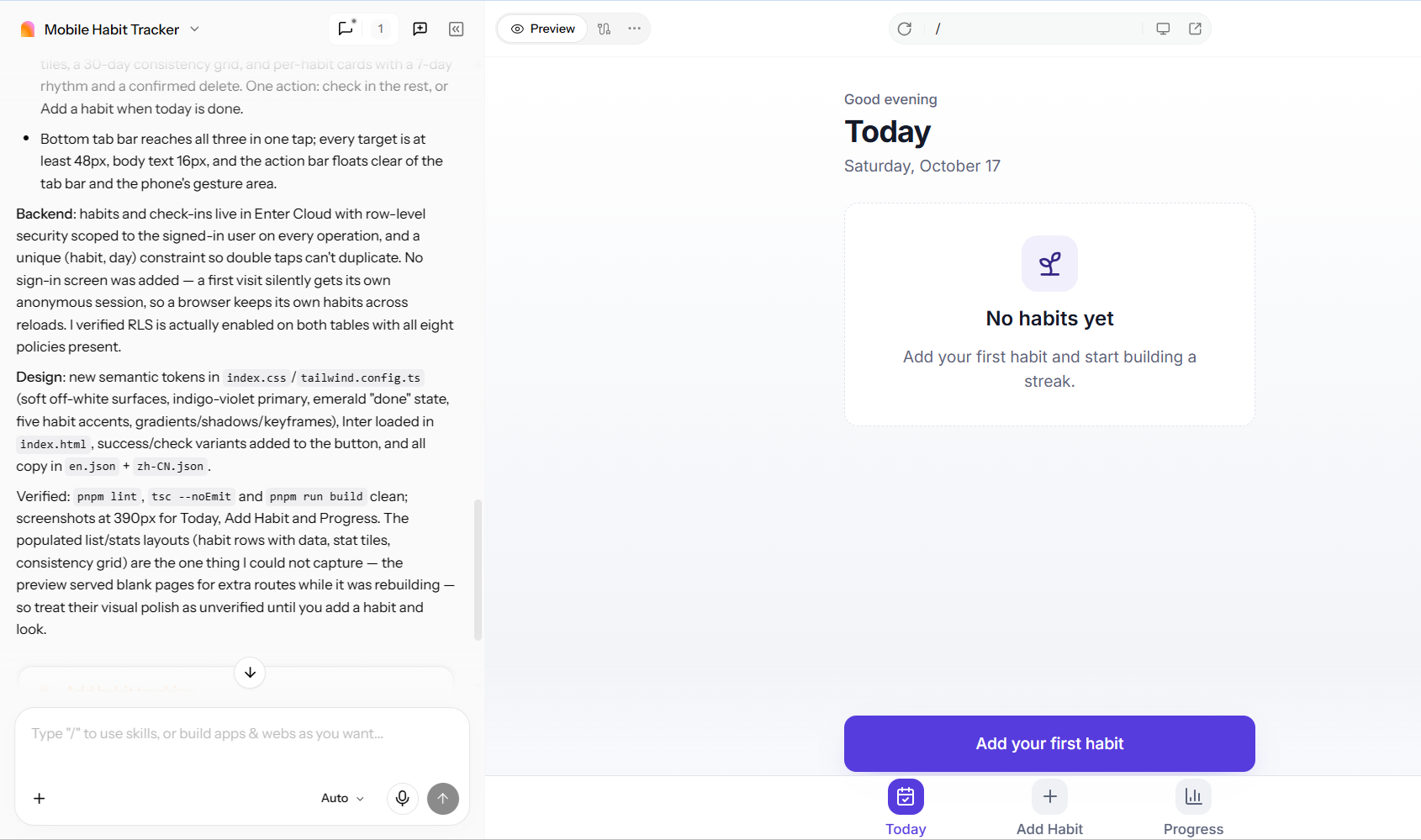
Now preview the running interface and compare it with your prompt. Look for missing screens, broken flows, wrong hierarchy, and layouts that fail at phone width. If the code or structure is off, re-prompt instead of patching it by hand.
Step 5: Refine the Layout in the Visual Editor
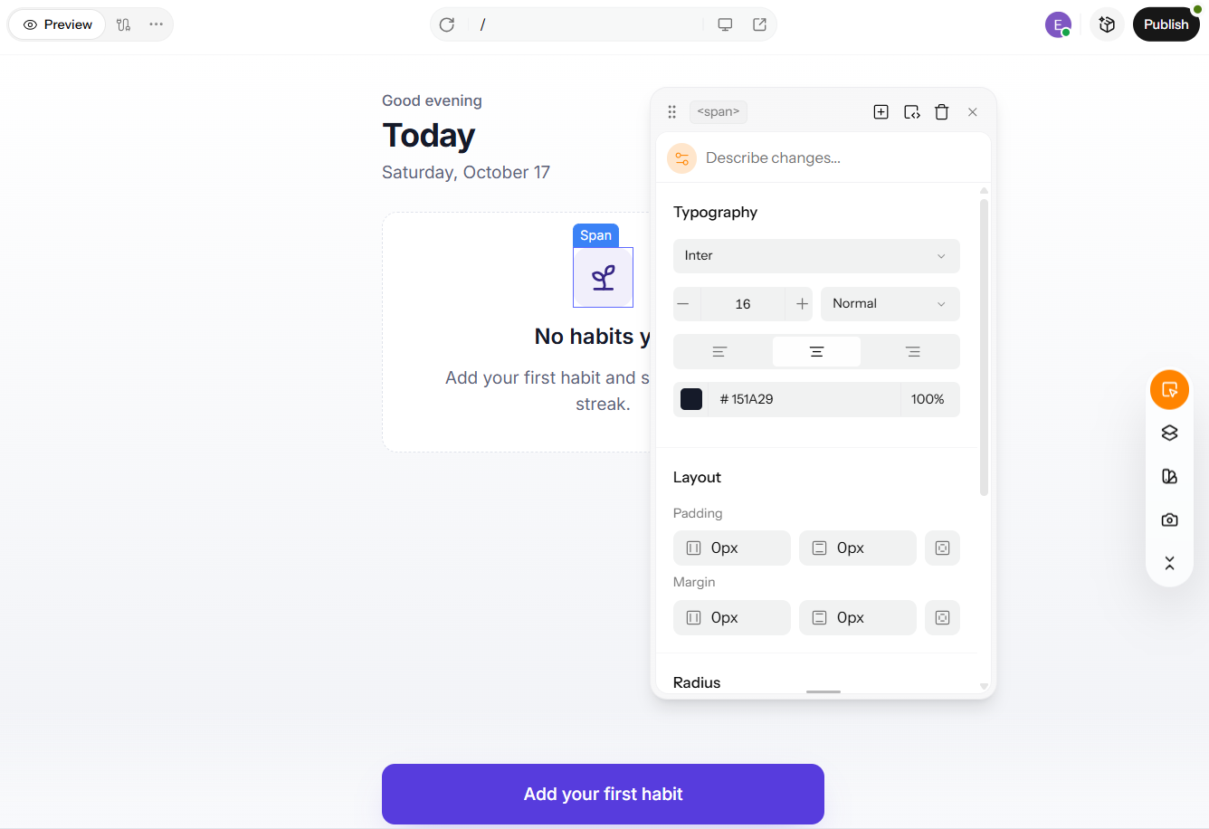
Once the structure is right, fine-tune the details on the live canvas. Adjust fonts, colors, spacing, and elements, and use AI help for repetitive changes. Tie each edit to a practice from this article, like hierarchy, whitespace, or consistent styling. Learn more about Visual Editor.
Step 6: Publish and Keep Iterating
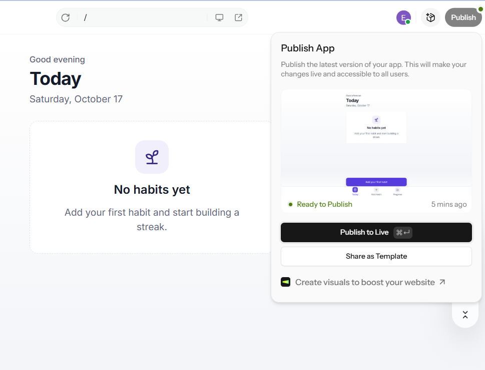
Once the screens have been reviewed and approved, publish the app to deploy it to the web. After that, present it to real users. As you receive feedback, return to the prompt or editor to make adjustments, following the same cycle as the testing practice mentioned earlier.
Conclusion
Good interfaces come from a few habits, not a lot of tricks. Keep it simple. Keep it consistent. Give feedback for every action. Include everyone. Test with real users. That’s the core of best practices for UI design, and it holds whether you’re designing a landing page or a full app.
On phones, best practices for mobile app UI design include three things: easy thumb reach, properly sized tap targets, and native patterns people already know.
When it comes to tools, pick them by the job. A dedicated design tool like Figma fits deep, collaborative design work. Enter Pro is the faster route from idea to a live interface, since you describe the screens and refine them in the Visual Editor. Start building now in your Enter workspace.
FAQs About Best Practices for UI Design
What are the most important UI design best practices?
Start with simplicity, clear visual hierarchy, and consistency. Then add accessibility, immediate feedback, responsive layout, and testing with real users. Together, these make an interface easy to understand and hard to misuse. You can find all 15 practices, each with a real example, in the section above.
What is the difference between UI and UX design?
UI is what people see and touch: layout, color, type, and buttons. UX is the whole journey, including research, flows, and structure. A button’s look is UI. Whether the checkout flow makes sense from start to finish is UX. Good products need both to work together.
What are the best practices for mobile app UI design?
Design for thumbs, with frequent actions within easy reach. Use tap targets of about 44×44 pt on iOS or 48×48 dp on Android. Follow each platform’s conventions, cut typing with autofill and pickers, and keep screens fast. Always test on real devices, not only emulators.
What are the best UI design tools for beginners?
Choose the right tool based on your needs. Figma is ideal for collaborative design and prototyping. Penpot is a solid open-source alternative. Enter Pro is a great option for beginners who prefer to describe screens using simple language. It allows them to generate working React and Tailwind UI components. Before making a commitment, be sure to check the current free plans and their limitations for each tool.
How do I check whether my UI is accessible?
Start with a contrast checker: body text needs at least 4.5:1. Then navigate the whole screen using only the keyboard, and try a screen reader. Run an automated tool like WAVE or axe to catch what you missed. Aim to meet WCAG AA criteria.
What are the most common UI design mistakes?
The usual culprits include clutter, inconsistent styles, weak hierarchy, tiny tap targets, low contrast, slow loading, long forms, and missing feedback. Each one has a fix in the 15 practices above: simplify, use a design system, build hierarchy, size targets properly, check contrast, optimize speed, prevent errors, and give feedback.
How can Enter Pro help me build a UI that follows these rules?
Enter Pro turns plain-language prompts into React and Tailwind UI. Put the rules straight into your prompt, like one primary action per screen, a mobile-first layout, and readable contrast. Then refine fonts, colors, and spacing in the Visual Editor. See the Enter Pro section for the full steps.
How do I review and refine a UI built with Enter Pro?
Review the generated code first, then the running build, before you edit anything visually. If the structure is off, re-prompt rather than patching by hand. Then refine in the Visual Editor, check responsiveness and accessibility, and publish. See Steps 3–6 in the Enter Pro section.