
Mobile Responsive Website: A Complete Guide to Modern Design
Unlock the secrets to mobile responsive website design! Explore key principles, benefits, and how to build a mobile-friendly site with our expert guide.
Building a mobile responsive website is the only way to stop losing frustrated visitors who leave your site when it looks broken on their phones. We have all dealt with tiny buttons that are impossible to tap and text that requires constant zooming just to read a single sentence. These technical hurdles kill your conversion rates and hurt your brand's credibility. Enter Pro solves this by using AI to build perfectly fluid designs that work on every device automatically. In this guide, we will show you how to create a professional, mobile-first experience without touching a single line of co
What is a mobile responsive website
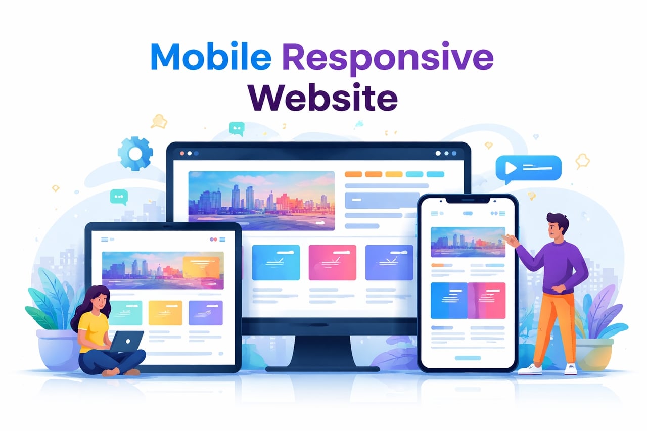
A mobile responsive website adapts its design, including images and text, to fit the dimensions of the screen it's being viewed on. It can function effectively on any screen, including smartphones, tablets, and computers, without having separate versions. It has flexible grids, pictures, and CSS media queries that can assist in rearranging the website according to the user's screen. This ensures that the text remains clear and navigation is convenient. It loads effectively, and there is no need for users to zoom in or scroll sideways. Mobile responsive design is beneficial in terms of accessibility and user experience. It can also increase search engine results, as search engines prefer mobile-friendly sites.
Why mobile responsive design matters in 2026?
In 2026, a mobile-friendly site is the foundation of digital success. More than 65% of all web traffic now comes from smartphones and tablets rather than desktops. If your site is not responsive, you are ignoring the majority of your audience. This design approach creates a much better user experience. Pages load faster, text is easy to read, and buttons are simple to tap. Google also rewards these sites through mobile-first indexing. This means your search ranking depends on how well your site works on a phone. For your business, this leads to lower bounce rates and much higher conversion rates. Customers stay longer and buy more when the interface is smooth. Staying mobile-responsive gives you a sharp competitive edge in an increasingly mobile world.
Key principles of mobile responsive design
A mobile responsive website relies on specific rules to look great everywhere. These core principles ensure your layout stays flexible and functional on any screen size or device.
- Fluid grid layouts
In the past, designers used fixed pixels for layouts. This made websites look stiff and broken on smaller screens. Today, we use fluid grids based on percentages. Instead of saying a column is "400 pixels wide," we say it is "50% of the screen." This allows the entire layout to shrink or expand like an accordion. As the browser window changes, every element moves proportionally to maintain a clean balance.
- Flexible images and media
Large images can easily break a mobile layout if they don't resize. Flexible media ensures that images and videos never grow wider than the screen they are on. By setting a simple rule in the code, images will automatically scale down to fit a narrow phone screen. This prevents awkward horizontal scrolling and keeps your site looking sharp without slowing down the page load.
- CSS media queries
Think of media queries as the "brain" of your responsive design. They are small bits of code that detect the user's screen width. Once the screen reaches a certain size, the media query triggers a new set of style rules. For example, it can tell the site to hide a massive banner on a phone or change a horizontal menu into a "hamburger" icon to save space.
- Mobile-first design approach
This principle means you start your design process with the smallest screen in mind. It is much easier to start with the essentials for a phone and add more features as you move up to a desktop. This forces you to prioritize your most important content and ensures that your mobile website design is never an afterthought, but the core focus of your project.
How to build a mobile responsive website using Enter Pro
Building a mobile responsive website is simple with Enter Pro. It is a powerful mobile-friendly website builder designed for modern creators. It uses vibe coding, allowing you to create websites. This means you just describe your idea in natural language. No need for you to write any complicated code. The platform uses top AI models like GPT-5.4, Claude 4.6 Sonnet, and Gemini 3 Pro. These tools generate responsive layouts and content for you automatically. If you work with a team, you can use real-time editing. This makes the whole process much faster and more efficient. Enter Pro also offers integrations with tools like GitHub for version control. Supabase for backend services, and Stripe for handling payments. It helps users build and launch responsive websites seamlessly.
Steps to build a mobile-friendly website design with Enter Pro
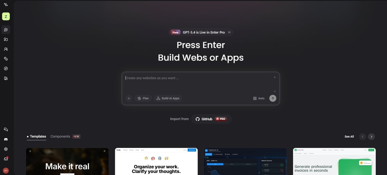
Are you ready to begin? With Enter Pro's AI-powered tools, you can start your mobile-friendly website in just three easy steps.
Step 1: Describe your website idea
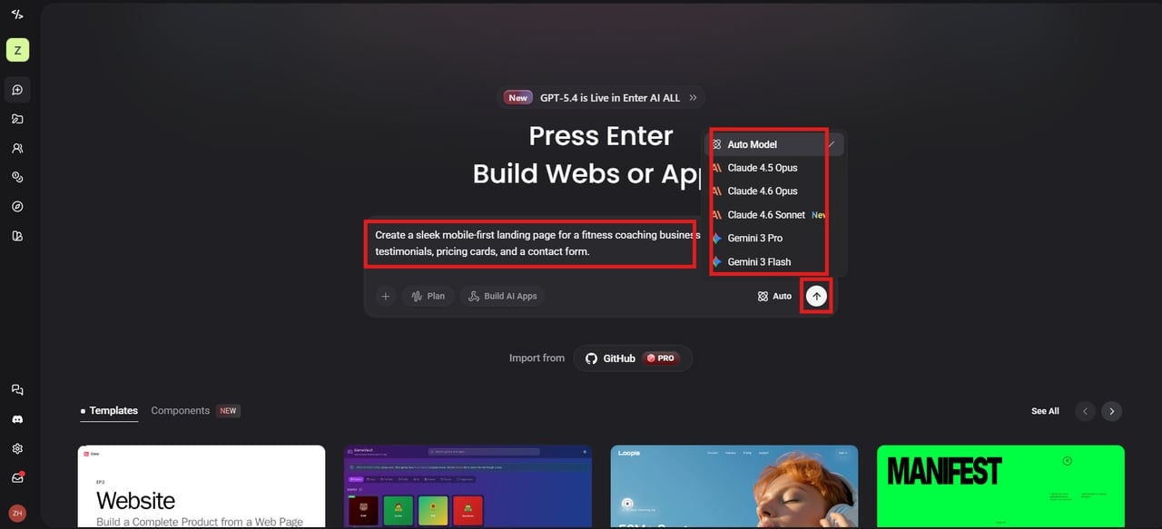
Go to the Enter Pro website and sign in to your account. After you get to the dashboard, start a new project and open the chat window. Let the AI know exactly what you want it to do. Select specific AI models from the list, like Gemini 3 Pro or Claude 4.6 Sonnet. Once you are ready, just hit the Build button.
Step 2: Refine with the visual editor
Enter Pro generates the layout, sections, and responsive elements automatically. You do not need to look at any code to make changes. Simply click on things like text, images, or buttons to edit them directly on the canvas. It is as easy as dragging and dropping.
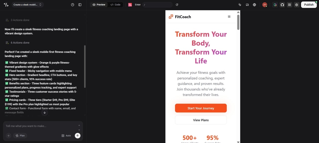
Step 3: Preview and launch
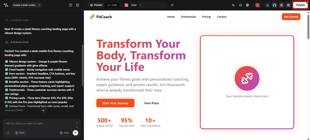
See how your site looks on phones, tablets, and desktops. Once everything looks perfect and works smoothly on every screen, click "Publish" to share your new site with the world.
Key features of Enter Pro's free mobile website builder
- Professional apps with no coding required
Whether you are a founder or a designer, you can turn your words into a live site. Enter Pro streamlines mobile website development by handling the backend logic and design while you just describe your idea. You get a professional-grade app ready in minutes.
- The ultimate template marketplace & app remix
You don't have to start from zero. You can "remix" the community's best templates with a single click. This gives you a full-stack clone—including the database and frontend—so you can launch a proven layout immediately.
- Visual editor for precision control
Stop guessing with text prompts alone. Stop guessing with text prompts. The Visual Editor lets you simply click anywhere on your canvas to instantly tweak styles or text. The Visual Editor offers the precision of hand-coding with the speed of AI.
- 100% code ownership
You own everything you build. Unlike other platforms that lock you in, Enter Pro lets you export your full source code at any time. You can host it on your own servers, giving you total freedom and peace of mind.
Best practices for mobile responsive website design
Creating a great mobile responsive website is about more than just fitting things on a screen. You need to focus on how real people interact with their phones. Follow these tips to make your site shine:
- Ensure content is easy to read
Your text should be clear and large enough to read without any zooming. Use high contrast colors, so words pop against the background. Adding extra space between lines helps visitors scan your content comfortably on smaller screens.
- Keep the layout compact and content-focused
Mobile screens do not have much room. Prioritize your most important information and remove anything that isn't necessary. A clean, simple layout helps users find what they need quickly without getting distracted by clutter.
- Design for small screens first
Always keep the tiny screen in mind when you build your layout. Avoid overcrowding your pages with too many elements. Ensure everything fits neatly within the screen edges so users can navigate and interact with your site naturally.
- Make buttons easy to tap
People use their fingers, not a mouse, on a phone. Make sure your buttons and links are large enough to hit easily. Leave enough space between clickable items so users don't accidentally tap the wrong thing.
- Place important elements within thumb reach
Most users use their thumbs to interact while holding their phone with only one hand. Place your menu, other buttons, and search bars within your "thumb zone" at the bottom or middle of your screen.
- Use responsive images
Your photos should automatically grow or shrink based on the device. This keeps your visuals looking sharp and professional. It also prevents large images from breaking your layout or making the page load too slowly.
Conclusion
Building a mobile responsive website is the best way to ensure your brand succeeds in 2026. We have explored how flexible grids, readable fonts, and thumb-friendly buttons create an amazing experience for your visitors. Remember, a site that works perfectly on a phone isn't just a "nice feature"—it is essential for higher search rankings and better business results. Enter Pro's mobile site builder makes this entire process effortless by combining the power of AI with a simple, no-code interface. You don't have to be a tech expert to start a professional, high-performing website that looks great on all devices. Whether you are starting from scratch or remixing a template, Enter Pro gives you the tools to build fast and own your code.
FAQs
- How to check if a website is mobile responsive?
You can check by simply resizing your desktop browser window to see if the content moves. For a more professional check, use the "Inspect" tool in your browser to simulate different phone models. Enter Pro also provides a built-in preview tool that shows you exactly how your site looks on various mobile devices while you are building it.
- What is the difference between responsive and adaptive design?
Responsive design is fluid and changes smoothly to fit any screen size like a liquid. Adaptive design uses several fixed layouts that "snap" into place for specific devices, like a tablet or a phone. Responsive design is usually better because it covers every possible screen width, ensuring no user is ever left with a broken layout.
- Can I build a mobile responsive website without coding?
Yes! You can have a professional site without ever having to write a single line of code. Sites like Enter Pro use a form of "vibe coding" where you simply describe your vision in your own words. The AI agents will then code your site's layout and other responsive features for you.
- Do I own the code if I use a mobile website creator?
With most builders, you are locked into their system. However, Enter Pro gives you 100% code ownership. You can always export your complete source code and run it on your own servers. This means that you are never "trapped" and are able to have complete control over your digital assets that you have created with the help of AI agents.
- Why should I use SVG images for mobile web design?
Because they're vector-based, SVGs retain their sharpness no matter how you scale them. Plus, their small file sizes mean quicker loading times, a real boon when you're on a mobile connection. Since they are code-based, they are easy to animate and style. This makes them perfect for crisp logos and icons on high-resolution smartphone screens.
- What is the difference between a responsive web and a mobile app?
A responsive website runs inside a browser and adapts to different screen sizes. A mobile app is installed directly on a device and built for operating systems like Android or iOS, giving deeper access to device features. Enter Pro helps you build both responsive websites and mobile apps from simple prompts.