

User Experience Design Basics: A Practical Guide for Beginners
Learn user experience design basics with a practical scorecard, proven UX principles, a step-by-step design process, and a 30-minute audit to improve real products.
One time I had a problem with a checkout process, and every step of it was difficult due to poor navigation. That was an eye-opener to me, and it was a lesson in how little things can irritate users and destroy trust. Understanding user experience design basics can help you catch these issues before they cost you users. But many guides talk about UX theory without demonstrating how to assess actual products. This hands-on guidebook includes fundamentals, a seven-point scorecard, a step-by-step process, and a fast audit for founders, product managers, developers, and marketers. You'll also learn about a no-code UI/UX design tool.
What is user experience? A plain-language definition
User experience (UX) refers to the way in which you engage with a product and the feelings that you have while doing so. It includes everything from seeing an ad or app store page to onboarding, using it, customer support, follow-up emails, and even coming back. I have attempted to do one thing in a familiar application and observed how easily navigation helped save time and how difficult and confusing menus made it harder. These moments are important because 88% of online consumers are less likely to come back after a poor experience.

UX vs UI: The difference that trips up beginners
While UX and UI are closely related, they play different roles in product development. Consider a restaurant: UI involves the menu and the interior; UX involves booking, waiting times, service, and whether you would be back again. UI is part of UX; therefore, all decisions made in the interface will ultimately impact the overall experience you are providing. I've previously used a fantastic food delivery app that had a couple of crashes while checking out; Beauty couldn't make up for that. The table below can help you distinguish between the two by focus, key question, and measurement.
| Aspect | UI | UX |
|---|---|---|
| Focus | Visual interface | Overall experience |
| Key question | Does it look clear? | Is it easy and satisfying? |
| Measurement | Visual consistency, usability | Task success, satisfaction, retention |
The basics of user experience design: A honeycomb scorecard you can use
There are a wide variety of UX frameworks that are shaped as elements, pillars, layers, and honeycombs. Mostly, they overlap, and it is difficult to know where to begin. The easiest one to use to check the basics is Peter Morville's UX Honeycomb. It divides a good experience into seven qualities, and you can audit all seven of them in less than an hour.
The seven qualities
| Quality | Plain-English definition | Audit question |
|---|---|---|
| Useful | It solves a real problem or meets a real need. | Would the people we built this for miss it if it disappeared? |
| Usable | People can complete tasks easily and without confusion. | Can a first-time user finish the main task without help? |
| Findable | People can locate the product and the content and features inside it. | Can users find what they need in under a minute, via navigation or search? |
| Credible | People trust it, believing what it says and feeling safe using it. | Does anything make a user hesitate, such as unclear pricing, missing contact details, or dated content? |
| Accessible | People of all abilities can use it, including those with visual, motor, hearing, or cognitive differences. | Can someone use it with a keyboard only or a screen reader, and is the contrast readable? |
| Desirable | It looks and feels good enough that people want to use it. | Does visual design, tone, and brand make people want to come back? |
| Valuable | It delivers value to the business as well as the user. | Does it support a measurable goal, such as revenue, retention, or reduced support costs? |
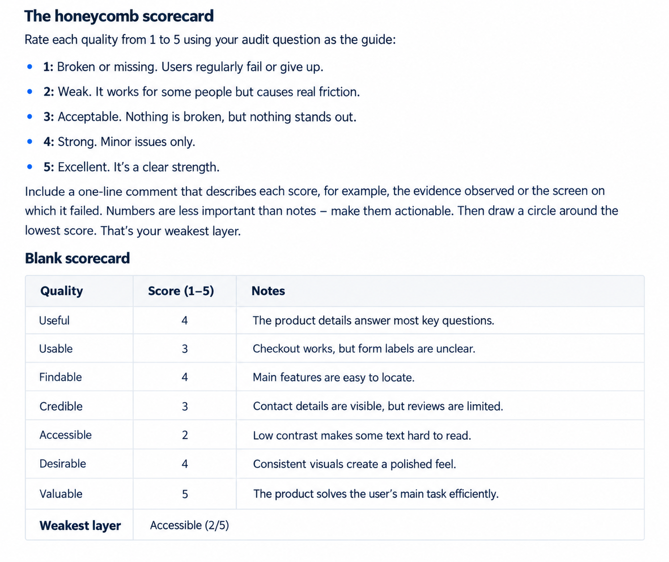
The honeycomb scorecard
Rate each quality from 1 to 5 using your audit question as the guide:
- 1: Broken or missing. Users regularly fail or give up.
- 2: Weak. It works for some people but causes real friction.
- 3: Acceptable. Nothing is broken, but nothing stands out.
- 4: Strong. Minor issues only.
- 5: Excellent. It's a clear strength.
Include a one-line comment that describes each score, for example, the evidence observed or the screen on which it failed. Numbers are less important than notes – make them actionable. Then draw a circle around the lowest score. That's your weakest layer.
Core UX principles in practice
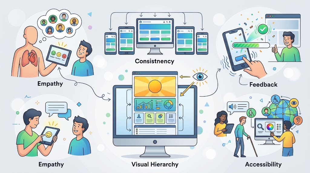
- Empathy and user needs: Good UX addresses users' goals, frustrations, and circumstances. I noticed meditation apps with short sessions make daily practice easier. This supports Honeycomb's usefulness and improves retention.
- Consistency: Users should be able to navigate products with ease because of familiar layouts and interactions. Google's ecosystem is based on familiar patterns in its services.
- Visual hierarchy: Clear headings, spacing, and prominent actions guide the eye. A clear home screen of a design tool makes it easy for users to locate templates.
- Feedback and user control: Interfaces should provide feedback and give users the ability to correct their errors. After sending, Gmail provides you with Undo Send. Clear confirmations are important to me because they help to grow trust and minimize support requests.
- Accessibility and inclusive design: Products should be capable of being used by people with various capabilities under different conditions. Improved access with readable contrast, labelled controls, and keyboard navigation.
The UX design process, step by step
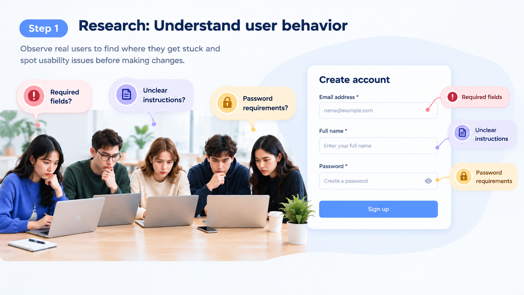
Step 1: Research: Understand user behavior
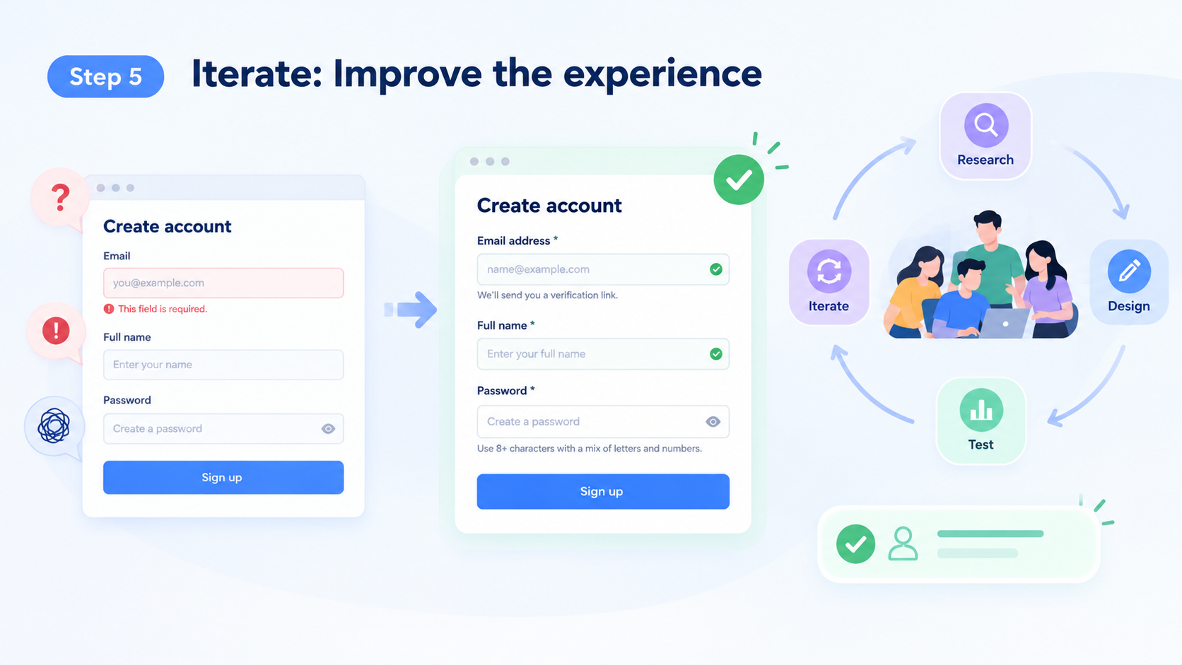
Research is the first step in the UX design process, as it is used to gain insight into how people interact with a product. I have observed five individuals filling out a registration form and noticed the following areas of confusion: required fields, unclear instructions, and password requirements. These observations were used to determine potential problems with usability prior to any design changes.
Step 2: Define: Identify the problem
Once observations are made, the main user problem definition follows. In this case, the users had trouble with the registration process because it was not clearly explained. A clear problem statement helps to guide design decisions around real-world user needs, not assumptions or personal preferences.
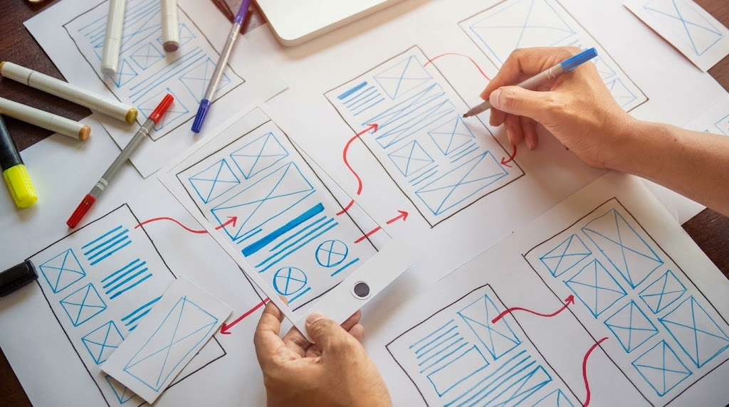
Step 3: Design: Create wireframes and prototypes
Once the issue is understood, designers brainstorm ideas using sketches, wireframes, or interactive prototypes. I drew up a more straightforward sign-up form with easy-to-understand labels and password requirements. Paper sketches are great for the early stages, and Figma can be used to build prototypes that are interactive before development.
Step 4: Test: Evaluate the proposed solution
Testing is used to find out if the new form is easier for users to use to register. I asked the participants to fill out the form without help. They indicated whether labels were clear, errors were obvious, and whether registration was easy. These usability sessions were used to test the proposed enhancements.
Step 5: Iterate: Improve the experience
I changed labels that were confusing, error messages, and enhanced field instructions based on the testing results. There were then fewer registration errors by the participants. But UX design isn't always linear, and teams can end up going back to the beginning. If the research is not conducted, costly redesigns can result if the problem is not solved.
The UX basics most beginners overlook
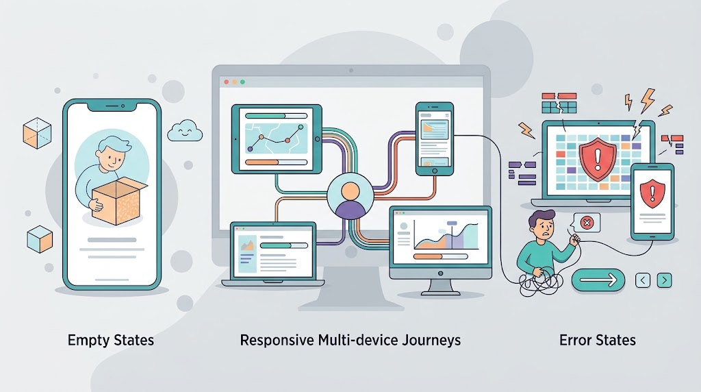
Empty states, error states, and other UX basics are some of the things that most beginners don't consider when designing their user experience. Edge cases (such as lost connections or abandoned tasks) should also be considered to avoid any frustrations. Multi-device journeys demand uniformity in user experience across phones, tablets, and desktops. Also, talk with developers about technical limitations at the start to understand the limitations and prevent expensive re-designs. Provide clear and informative error messages that tell the user what is wrong and how to fix it, instead of using generic error messages.
Where to start based on your role
- Designer or career switcher: As a designer or career switcher, begin with user research and prototyping. To learn about the needs, interview your potential users. Then develop simple wireframes and test to see if the design is functional.
- Founder or product manager: Concentrate on the main task and measurable outcomes. Determine the first thing users need to do. Monitor completion rates, conversion rates, and task failures to assess improvements.
- Developer: First, check developer feedback, accessibility, and performance. Check loading indicators, error messages, keyboard navigation, and page speed. These details will make users feel more confident when dealing with your product.
- Marketer or e-commerce team: Review checkout and form friction and mobile experiences. Test each step, look for confusing fields or unnecessary actions. Focus on improvements that make it easier for visitors to make a purchase.
- Business leader: For business leaders, get an understanding of UX research & performance metrics. Analyze task success, user feedback, conversion rates, and support requests. Relate these findings to business results while making design investments.
A 30-minute UX self-audit you can run tomorrow
A UX self-audit takes 30 minutes and can help you pinpoint some usability issues before they become an annoyance for more users. First, select the most critical task, time it, and observe it being performed without support. Record all hesitations, eliminate or clarify one element that is confusing, and try the experience again. Use a downloadable UX checklist combining these audit steps and a scorecard to track improvements.

Putting the basics to work on a budget with Enter Pro
AI-driven tools such as Enter Pro make it more feasible to create a website or app with a small budget. It has an AI website builder that allows you to develop tailored digital products with minimal coding. I used it to make my audit results into a usable test version without employing a development team. This allows you to experiment with navigation, layout, and interactions without investing a lot of time and resources. Rapid prototyping also provides greater opportunities for feedback, for uncovering usability problems, and for iterations. So you can make informed UX improvements and avoid high development costs.
What stood out to me about Enter Pro
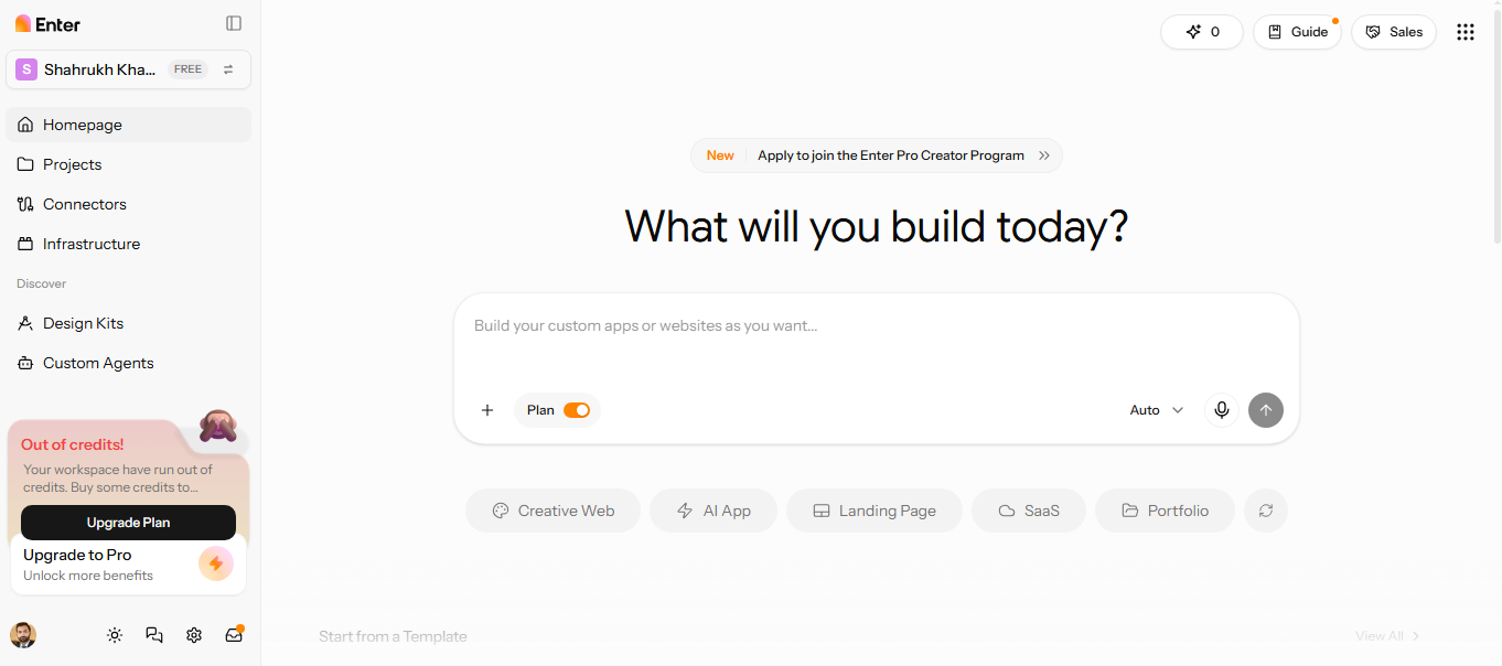
- AI-powered site and app development: I could describe my idea in plain language and generate a working draft. This made getting started more straightforward.
- Multiple AI models: I could switch models depending on my development needs. Enter Pro supports different AI options, including GPT-5.4 and Claude Opus 4.7.
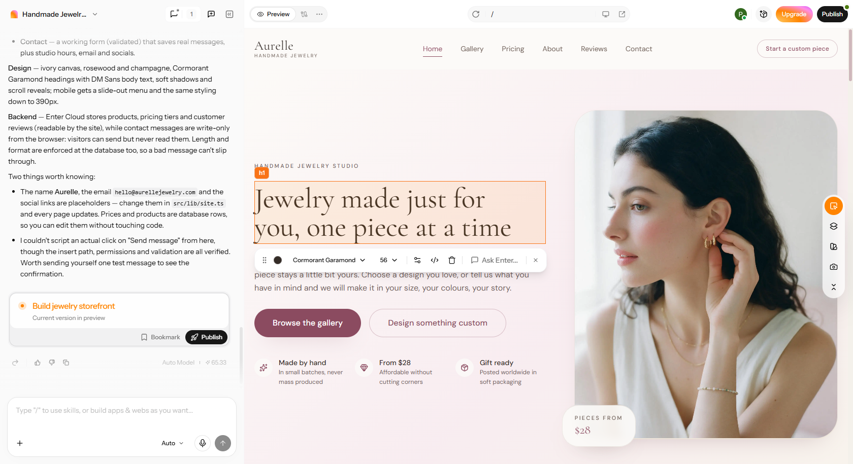
- Visual editing and customization: I could adjust layouts, spacing, and visual hierarchy without editing code directly. The visual editor helped address design issues identified during my scorecard review.
- Full source code access: I could access the generated source code rather than remain locked into the platform. This gave me the flexibility to involve developers, export code, or self-host my project.
How I built a custom site with Enter Pro in three steps
Step 1: Describe your niche
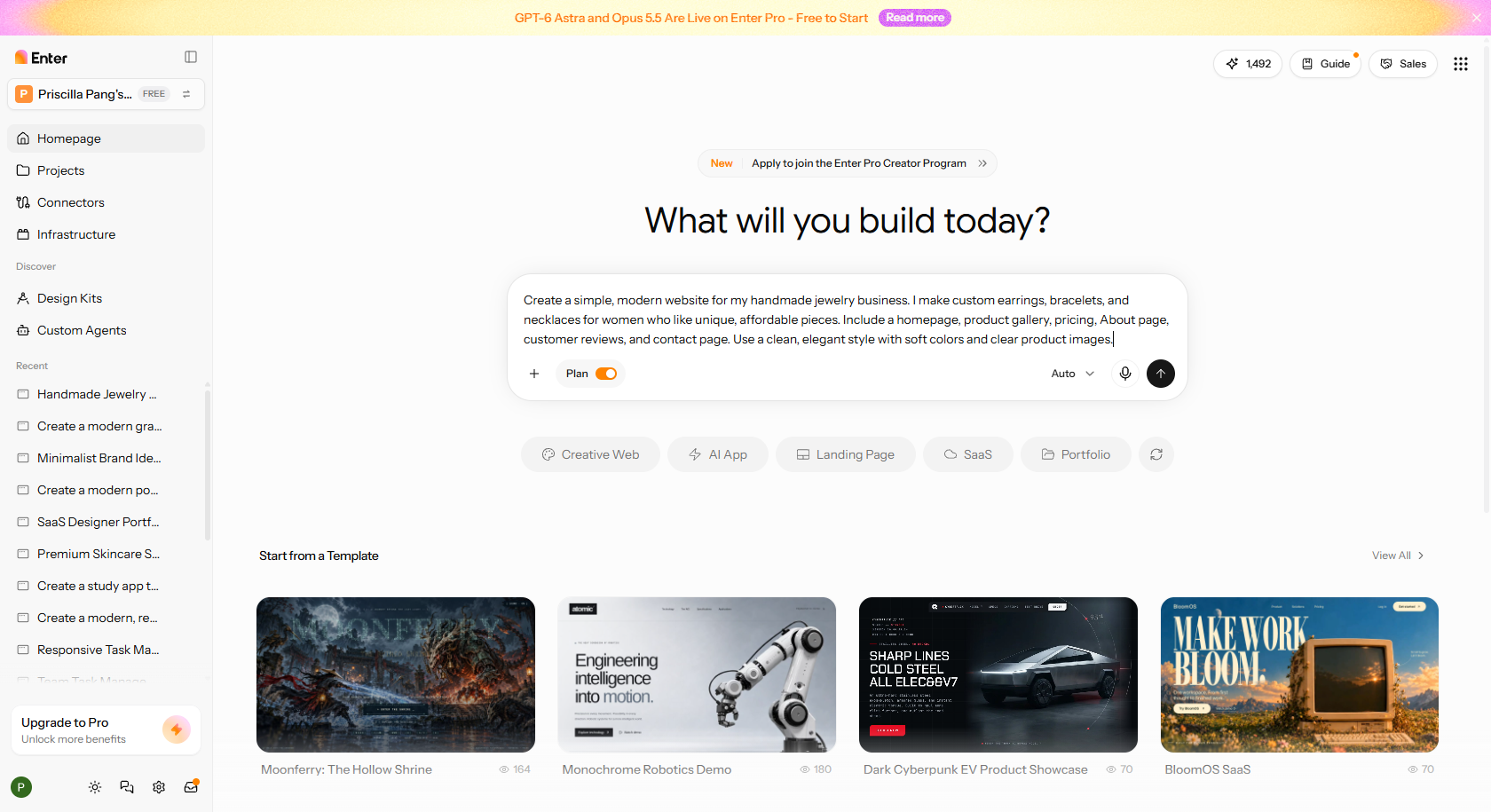
Write a detailed prompt outlining your website's purpose, target audience, required pages, desired features, and visual style. Include technical specifications and relevant workflows to help Enter Pro understand your requirements. Review your instructions and click "Generate" to create the initial website draft. Enter Pro will produce the code based on your project requirements. Review the generated code and make any necessary changes before proceeding.
Step 2: Customize your site
Once everything looks ready, click "Build Now" to begin generating your website. Navigate to the "Preview" tab to inspect your website's pages, navigation, interactive elements, and overall functionality. Use the top menu to refine the design or address performance issues identified during testing.
Step 3: Publish the consulting business site
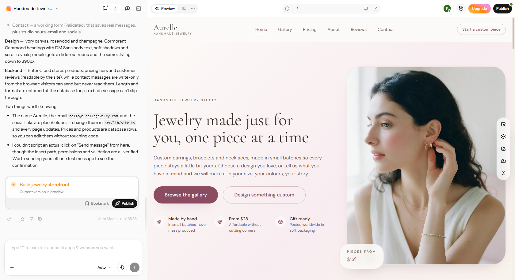
After confirming that everything works as expected, select the available "Publish" option to deploy your custom website.
Conclusion
Good user experience design starts with understanding user needs, identifying friction points, and testing practical improvements. By applying user experience design basics, you can use the UX Honeycomb scorecard to evaluate a product, follow a structured design process, and fix usability issues before they lead to costly redesigns. Tools like Enter Pro can help turn audit findings into working prototypes, making it easier to refine layouts and interactions without extensive coding. Try it today to make your user experience design friendly for users!
FAQs about user experience design basics
How can user experience design basics guide better design decisions?
UX basics can help you take out the guesswork and put in some research, usability testing, and behavioral data. They also create visual hierarchy, consistency, accessibility, and easier interactions. These principles decrease the amount of cognitive work and allow users to complete tasks efficiently. Rapid prototyping tools such as Enter Pro enable you to test layouts before committing time and money to development.
What are the 5 elements of user experience design?
Jesse James Garrett's framework consists of five UX elements: strategy, scope, structure, skeleton, and surface. Strategy sets user needs and business goals, and Scope sets content and features. Structure provides organization of information and interaction. Skeleton is used to lay out interface items and navigation, while surface is used to control typography, colours, spacing, and visual presentation.
Why are user experience basics essential for digital products?
Digital products that are easy to navigate, understand, and trust have certain UX basics. Simple interfaces minimize confusion, and easy-to-use designs cater to user needs. Another benefit of good usability testing is that it also uncovers issues before development expenses get too high. As a result, careful UX design can boost engagement, aid retention, lower support requests, and facilitate business conversions.
Which tools help you learn the basics of user experience design?
Figma supports wireframing and interactive prototyping, while Balsamiq helps beginners sketch simple layouts. Miro and Whimsical organize ideas and user journeys. Google Forms gathers feedback, while Maze supports usability testing. Coursera's Google UX Design Certificate and Interaction Design Foundation courses provide structured learning opportunities.
Can user experience design definition basics help plan user testing?
Yes, UX fundamentals do contribute to the definition of the testing goals, users, and realistic task scenarios. They also differentiate between task usability and users' overall emotions. With Enter Pro, you can build prototypes for evaluating navigation and interactions. Testing feedback then informs practical changes prior to further investment in development.
How can I improve my website's or app's user experience without a big redesign?
Start by simplifying navigation, improving loading speeds, and removing unnecessary form fields. Use descriptive buttons, accessible contrast, readable text, and mobile-friendly layouts. Analytics and heatmaps can reveal where visitors struggle. Enter Pro's visual editor also helps adjust spacing, layouts, and hierarchy without directly editing code.