

What is UI Design? A Complete Guide to User Interface Design
What is UI design? Learn how UI design shapes the look, feel, and usability of digital products — and why it's essential for every great user experience.
If you have ever used a mobile app, website, or software and felt it was easy, attractive, and simple to navigate, you have experienced good UI design. But what is UI design exactly? UI (User Interface) design focuses on how digital products look and how users interact with visual elements like buttons, icons, typography, colors, and layouts. It ensures that interfaces are not only visually appealing but also clear and functional. UI design plays a major role in shaping how users perceive and use digital products in their daily lives.
What is UI design?
UI design, or User Interface design, is the process of designing the visual and interactive elements of a digital product. It includes everything users see and touch on the screen — from buttons and menus to images and typography.
The goal of UI design is to create interfaces that are:
-
Visually consistent
-
Easy to understand
-
Simple to navigate
-
Pleasant to use
Types of UI design
UI design appears in different forms depending on how users interact with technology. Here are the main types of UI design and how each enables clear, efficient interaction.
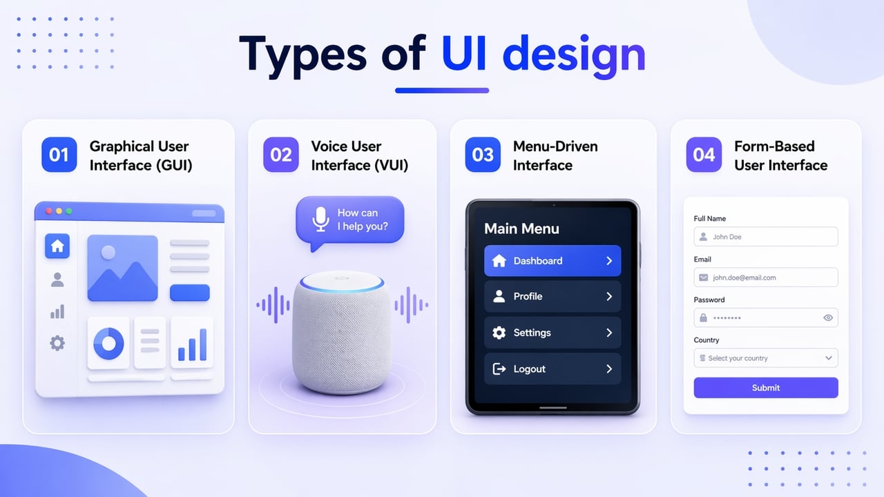
- Graphical User Interface (GUI)
The most common type of UI design, GUIs allow users to interact with a product through visual elements — icons, buttons, menus, and windows displayed on a screen. A graphical user interface allows users to interact with a device through graphical icons. Typically, interactions are facilitated through a mouse, trackpad, or some other point-and-click tool. Your laptop's desktop or home screen is an example of a GUI.
- Voice User Interface (VUI)
Voice interfaces remove the screen entirely and replace visual interaction with spoken commands. Words and syntax play the most crucial role in voice user interfaces. VUI uses speech recognition to understand voice commands. Notable examples of VUI include iPhone's Siri, Google Home's "Hey Google" feature, and Amazon's Alexa.
- Menu-Driven Interface
Menu-driven interfaces provide users with command options via a list or a menu. These commands can present themselves in full-screen or as a pop-up or drop-down. Common examples of menu-driven interfaces include ATMs, kiosks, and digital parking meters.
- Form-Based User Interface
Form-based UIs center on structured data input — text fields, checkboxes, radio buttons, dropdowns, and date pickers. They are the workhorses of enterprise software, onboarding flows, checkout pages, and any product that needs to collect information from users systematically.
What is the difference between UI and UX design?
UI (User Interface) and UX (User Experience) design are closely related but serve different purposes in digital products.
UI design focuses on the visual and interactive elements users see and touch, such as buttons, icons, typography, colors, and layouts. It determines how the interface looks and responds.
UX design, on the other hand, focuses on the overall experience users have while interacting with the product, including research, user flows, usability, and satisfaction.
In simple terms, UX plans how the product works, while UI shapes how it appears during use. Both must work together to create intuitive, enjoyable, and effective digital experiences.
Key principles of effective UI design
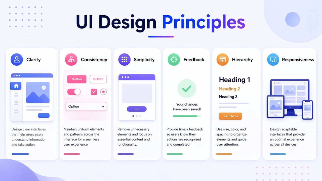
To create interfaces that are both beautiful and functional, designers follow several foundational rules. Here are the eight key principles of effective UI design:
-
Clarity: Every element on the screen should communicate its purpose instantly. Labels, icons, and actions must be easy to recognize without forcing users to think. Clear wording, readable fonts, and simple layouts help users understand what to do next without confusion.
-
Consistency: Design patterns, colors, typography, and button styles should remain uniform across all screens. Consistency builds familiarity, reduces learning time, and helps users predict how the interface will behave in different sections of the product.
-
Visual hierarchy: Important elements should stand out through size, contrast, spacing, and placement. A strong visual hierarchy guides users’ eyes naturally from the most important information to secondary details, improving navigation and task completion.
-
Feedback: Users need immediate responses to their actions. Whether it’s a button press, form submission, loading state, or error message, feedback reassures users that the system is working and informs them of the outcome of their actions.
-
Simplicity: Remove unnecessary elements and avoid clutter. A simple interface focuses only on what users need to complete their tasks, reducing distractions and making the experience smoother and more efficient.
-
Accessibility: UI design should be usable by people with different abilities. Proper color contrast, readable text sizes, keyboard navigation, and clear labels ensure that everyone can interact with the interface comfortably.
-
Responsiveness: Interfaces must adapt seamlessly to different screen sizes and devices. Whether on mobile, tablet, or desktop, the layout and elements should adjust to provide a consistent and usable experience.
-
Flexibility and efficiency: An effective UI supports both beginners and experienced users. Shortcuts, customizable options, and streamlined workflows allow frequent users to complete tasks faster while still keeping the interface simple for new users.
Key user interface elements
To build a functional interface, designers use a library of interface elements. These are building blocks that allow users to interact with a system. They generally fall into four categories:
-
Input controls: These allow users to enter information into the system. Examples include checkboxes, radio buttons, dropdown lists, text fields, and date pickers.
-
Navigational components: These help users move around the product or website. This includes breadcrumbs, search fields, paginations, sliders, and navigation bars.
-
Informational components: These share information with the user. Examples include tooltips, icons, progress bars, notifications, and message boxes.
-
Containers: These hold related content together to maintain layout structure, such as accordions (stacked lists of headers that expand) or cards (compact entries for different topics).
UI design tools you should know
To bring your interface concepts to life, you need the right software. The landscape has shifted from basic vector tools to AI-driven platforms that bridge the gap between design and code. Here are four essential tools for 2026:
-
Figma: The industry standard for collaborative design. Figma allows multiple designers to work on the same file in real-time. With its robust "Dev Mode" and extensive plugin ecosystem, it remains the go-to choice for creating high-fidelity prototypes and design systems that are ready for handoff.
-
Framer: If your goal is to move from a design to a live website without a developer, Framer is the perfect tool. It treats the canvas like a live browser, allowing for complex animations and responsive layouts that can be published as a high-performance website with a single click.
-
Sketch: A classic choice for macOS users, Sketch remains a powerhouse for vector-based UI design. It is highly respected for its clean interface and specialized focus on icon design and pixel-perfect layouts, making it a favorite for designers who prefer a dedicated desktop application.
Real-world examples of UI design
UI design is everywhere, from the device in your pocket to the kiosk at your local bank. Understanding how industry leaders implement these principles can help you recognize great design in action.
- Apple iOS
Apple's iOS is one of the most studied UI systems in the world. Every icon is consistently sized and placed on a clean grid. Typography is legible at every scale. Gestures feel natural because they mirror real-world physical actions — swipe, pinch, tap. The interface uses whitespace generously, letting each element breathe rather than competing for attention.

- Google Search
A single search bar on a white background. No banners, no sidebars, no competing calls to action. Google's search interface is arguably the most visited UI on the planet — and its power comes entirely from what has been removed, not what has been added.
- Spotify
Spotify balances a large content library with a UI that never feels overwhelming. Dark backgrounds make album artwork pop. Navigation is anchored at the bottom on mobile, within easy thumb reach. Playback controls are always visible, so users never lose their place in the experience.
- Airbnb
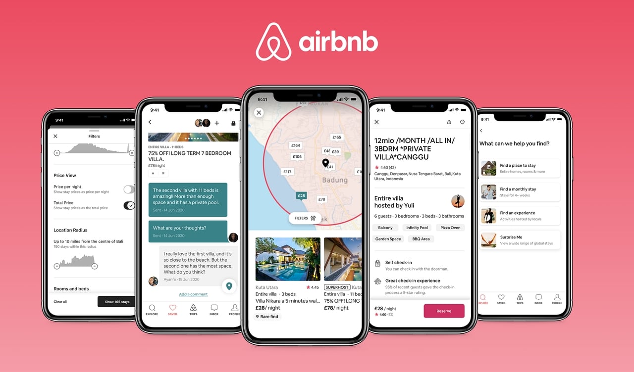
Airbnb's UI guides users through a complex multi-step decision — choosing a destination, dates, guests, and property type — without ever feeling complicated. Large photography does emotional selling. Filters are powerful but tucked away until needed. Each screen focuses on one decision at a time.
What makes it a strong UI example: progressive disclosure, strong visual hierarchy, and a UI that reduces a complex process to a series of simple, confident steps.
- Duolingo
Duolingo uses color, animation, and a clear progress system to make language learning feel like a game. Lesson screens are uncluttered. Correct answers get immediate positive feedback. Mistakes are acknowledged gently, with a clear path to try again. The owl mascot adds personality without cluttering the interface.
Best practices for exceptional UI design
Creating a beautiful interface is only half the battle; the best designs are those that feel invisible because they work so seamlessly. Follow these industry-proven best practices to ensure your UI is professional and user-centric:
-
Prioritize user goals: Design every screen around what users need to accomplish. Keep primary actions obvious and remove elements that don’t support the task.
-
Design for consistency at scale: Use a design system with reusable components, styles, and patterns, so interfaces remain uniform as products grow.
-
Use whitespace intentionally: Spacing improves readability and focus. Proper margins and padding prevent clutter and help users scan content easily.
-
Make actions obvious: Buttons, links, and interactive elements should look clickable. Clear labels and visual cues reduce hesitation and errors.
-
Test and refine continuously: Observe real users, gather feedback, and iterate. Small UI adjustments based on testing can greatly improve usability and satisfaction.
Build UI-driven websites with Enter Pro
Enter Pro is an AI-powered platform that lets you turn UI design ideas into real, responsive websites and apps without writing code. Instead of manual development, you simply describe what you want and Enter Pro uses advanced AI agents to generate layouts, styles, content, and even backend features automatically. Its visual editor lets you tweak fonts, colors, spacing, and elements in real time. Perfect for bringing UI concepts to life quickly. Whether you’re crafting a landing page, portfolio, blog, or full web app, Enter Pro helps you design, preview, and publish with minimum effort and maximum control.
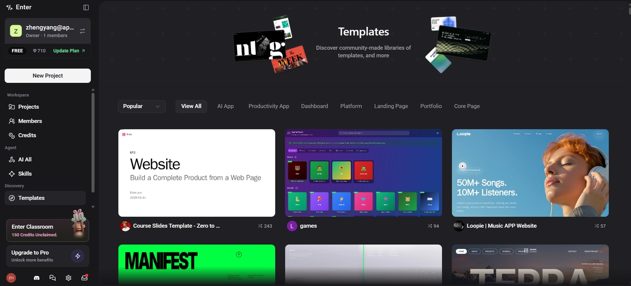
Key features
-
Integrated backend & cloud features: Built-in support for database, storage, serverless functions, and integrations like Stripe, Supabase, and analytics simplifies building dynamic, production-ready products.
-
Conversational "Vibe" editing: You can refine your website's visual identity through chat. By describing a specific "vibe"—such as "minimalist fintech" or "playful creative portfolio"—the AI adjusts typography, spacing, and color theory across the entire site.
-
Multi-model AI support & Agent tools: Access and integrate multiple cutting-edge AI models (e.g., GPT, Claude, Gemini) through unified workflows, and use AI agents for design, code generation, and planning.
-
Live deployment & hosting: Once the UI is generated, Enter Pro provides a one-click launch feature. It handles the hosting, domain connection, and even SSL setup, moving your project from a prompt to a live URL in minutes.
Conclusion
Understanding what is UI design helps you see how thoughtful visuals and interactions shape every digital experience. From layouts and typography to feedback and responsiveness, strong UI design makes products intuitive and enjoyable to use. Knowing the difference between UI and UX, the types of interfaces, key principles, tools, and best practices gives you a solid foundation to create effective designs. With modern platforms like Enter Pro, you can apply these principles directly to build real, responsive websites without complex coding. Mastering UI design empowers you to craft interfaces that look great and work effortlessly for users.
FAQs
- What is the main difference between UI and UX design?
UI focuses on visual and interactive elements such as buttons and colors, whereas UX concerns the overall logic, structure, and feel of the user's journey.
- What is a UI/UX designer?
A UI/UX designer is a professional who creates digital products by balancing user-centered logic with aesthetic appeal, ensuring interfaces are both easy to navigate (UX) and visually engaging (UI).
- What are the most common UI design mistakes?
Common pitfalls include cluttered layouts, inconsistent styling, poor color contrast, and obscure navigation that confuses users and increases bounce rates during their digital journey.
- Does UI design require coding knowledge?
No, UI designers primarily use visual tools like Figma. However, understanding basic HTML and CSS helps communicate effectively with developers and understand technical constraints.
- How does UI design affect SEO?
Google prioritizes user experience metrics. A clean, responsive UI improves page load speeds and navigation, leading to lower bounce rates and higher search engine rankings.